html - ¿Cómo crear lados redondeados desiguales en un div?
css css-shapes (1)
He estado tratando de hacer un DIV con lados redondeados desiguales como este:
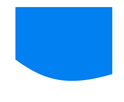
He comprobado algunas soluciones y lo más cerca que puedo llegar es usando el radio de borde. He usado:
border-bottom-left-radius: 80%50px;
border-bottom-right-radius: 30%30px;
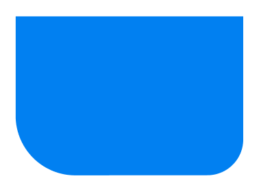
¿Cómo se puede hacer esto?
Puedes considerar
clip-path
.box {
  height: 200px;
  width: 200px;
  background: blue;
  -webkit-clip-path: circle(75% at 65% 10%);
  clip-path: circle(75% at 65% 10%);
}
<div class="box">

</div>
O utilice
radial-gradient
.box {
  height: 200px;
  width: 200px;
  background: radial-gradient(circle at 65% 10%, blue 75%,transparent 75.5%);

}
<div class="box">

</div>
O use un pseudo elemento con
border-radius
y confíe en el desbordamiento
.box {
  height: 200px;
  width: 200px;
  position:relative;
  overflow:hidden;
}
.box:before {
 content:"";
 position:absolute;
 top:0;
 left:-10%;
 right:-10%;
 bottom:10%;
 background:blue;
 border-radius:0 0 50% 100%;
}
<div class="box">

</div>
Y no olvidemos la solución SVG (como elemento regular o fondo)
svg {
 display:inline-block;
}

.box {
  display:inline-block;
  height:200px;
  width:200px;
  background:url("data:image/svg+xml;utf8,<svg xmlns=''http://www.w3.org/2000/svg'' viewBox=''0 0 64 64''  width=''200'' height=''200'' fill=''blue''> <path d=''M0 0 L0 28 C10 46 30 60 64 48 L64 0 Z'' /></svg>")0 0/100% 100% no-repeat;
}
<svg
  xmlns=''http://www.w3.org/2000/svg''
  viewBox=''0 0 64 64''
  width=''200'' height=''200''
  fill=''blue''>
  <path d=''M0 0 L0 28 C10 46 30 60 64 48 L64 0 Z'' />
</svg>

<div class="box">
</div>
Aquí hay una buena herramienta en línea para ajustar fácilmente el SVG
http://jxnblk.com/paths/?d=M0 0 L0 28 C10 46 30 60 64 48 L64 0 Z
También puedes considerar
mask-image
:
.box {
  height: 200px;
  width: 200px;
  background:blue;
  -webkit-mask-image: radial-gradient(circle at 65% 10%, #fff 75%,transparent 75.5%);
  mask-image: radial-gradient(circle at 65% 10%, #fff 75%,transparent 75.5%);

}
<div class="box">

</div>
Aquí hay otra sintaxis para la solución de
radial-gradient
sin el uso de la que
no se admite en Safari
.box {
  height: 200px;
  width: 200px;
  background:
    radial-gradient(circle, blue 60.5%,transparent 61%) 35% 100%/200% 200% no-repeat;
}
<div class="box">

</div>