svg color múltiple en trazo circular
colors gradient (2)
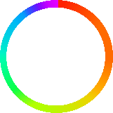
quiero crear un circulo de arcoiris
como la imagen de abajo:
¿Pero cómo puedo dibujar el degradado de parada de color curvo y múltiple?
Aquí está mi código actual:
<svg width="500" height="500" xmlns="http://www.w3.org/2000/svg" xmlns:xlink="http://www.w3.org/1999/xlink">
<defs>
<linearGradient id="test">
<stop offset="0%" stop-color="#f00"/>
<stop offset="100%" stop-color="#0ff"/>
</linearGradient>

</defs>

<circle cx="50" cy="50" r="40" fill="none" stroke="url(#test)" stroke-width="6"/>

</svg>
Este enfoque no funcionará. SVG no tiene gradientes cónicos. Para simular el efecto, tendría que simularlo con un gran número de pequeños segmentos de línea. O alguna técnica similar.
Actualizar:
Aquí hay un ejemplo. Aproximo los 360 grados de matiz con seis caminos. Cada camino contiene un arco que cubre 60 grados del círculo. Utilizo un degradado lineal para interpolar el color desde el principio hasta el final de cada ruta. No es perfecto (se pueden ver algunas discontinuidades en la combinación de colores) pero posiblemente engañaría a la mayoría de las personas. Podría aumentar la precisión utilizando más de seis segmentos.
    <svg xmlns="http://www.w3.org/2000/svg" version="1.1" width="100%" height="100%" viewBox="-10 -10 220 220">
      <defs>
        <linearGradient id="redyel" gradientUnits="objectBoundingBox" x1="0" y1="0" x2="1" y2="1">
            <stop offset="0%" stop-color="#ff0000"/>
            <stop offset="100%" stop-color="#ffff00"/>
        </linearGradient>
        <linearGradient id="yelgre" gradientUnits="objectBoundingBox" x1="0" y1="0" x2="0" y2="1">
            <stop offset="0%" stop-color="#ffff00"/>
            <stop offset="100%" stop-color="#00ff00"/>
        </linearGradient>
        <linearGradient id="grecya" gradientUnits="objectBoundingBox" x1="1" y1="0" x2="0" y2="1">
            <stop offset="0%" stop-color="#00ff00"/>
            <stop offset="100%" stop-color="#00ffff"/>
        </linearGradient>
        <linearGradient id="cyablu" gradientUnits="objectBoundingBox" x1="1" y1="1" x2="0" y2="0">
            <stop offset="0%" stop-color="#00ffff"/>
            <stop offset="100%" stop-color="#0000ff"/>
        </linearGradient>
        <linearGradient id="blumag" gradientUnits="objectBoundingBox" x1="0" y1="1" x2="0" y2="0">
            <stop offset="0%" stop-color="#0000ff"/>
            <stop offset="100%" stop-color="#ff00ff"/>
        </linearGradient>
        <linearGradient id="magred" gradientUnits="objectBoundingBox" x1="0" y1="1" x2="1" y2="0">
            <stop offset="0%" stop-color="#ff00ff"/>
            <stop offset="100%" stop-color="#ff0000"/>
        </linearGradient>
      </defs>

      <g fill="none" stroke-width="15" transform="translate(100,100)">
        <path d="M 0,-100 A 100,100 0 0,1 86.6,-50" stroke="url(#redyel)"/>
        <path d="M 86.6,-50 A 100,100 0 0,1 86.6,50" stroke="url(#yelgre)"/>
        <path d="M 86.6,50 A 100,100 0 0,1 0,100" stroke="url(#grecya)"/>
        <path d="M 0,100 A 100,100 0 0,1 -86.6,50" stroke="url(#cyablu)"/>
        <path d="M -86.6,50 A 100,100 0 0,1 -86.6,-50" stroke="url(#blumag)"/>
        <path d="M -86.6,-50 A 100,100 0 0,1 0,-100" stroke="url(#magred)"/>
      </g>
    </svg>
Fiddle aquí: http://jsfiddle.net/Weytu/
Actualización 2:
Para aquellos que desean más de seis segmentos, aquí hay algunos javascript que producirán una rueda con cualquier número de segmentos que desee.
function makeColourWheel(numSegments)
{
    if (numSegments <= 0)
        numSegments = 6;
    if (numSegments > 360)
        numSegments = 360;

    var  svgns = xmlns="http://www.w3.org/2000/svg";
    var  svg = document.getElementById("colourwheel");
    var  defs = svg.getElementById("defs");
    var  paths = svg.getElementById("paths");

    var  radius = 100;
    var  stepAngle = 2 * Math.PI / numSegments;

    var  lastX = 0;
    var  lastY = -radius;
    var  lastAngle = 0;

    for (var i=1; i<=numSegments; i++)
    {
        var  angle = i * stepAngle;

        // Calculate this arc end point
        var x = radius * Math.sin(angle);
        var y = -radius * Math.cos(angle);
        // Create a path element
        var arc = document.createElementNS(svgns, "path");
        arc.setAttribute("d", "M " + lastX.toFixed(3) + "," + lastY.toFixed(3)
                              + " A 100,100 0 0,1 " + x.toFixed(3) + "," + y.toFixed(3));
        arc.setAttribute("stroke", "url(#wheelseg" + i + ")");
        // Append it to our SVG
        paths.appendChild(arc);

        // Create a gradient for this segment
        var grad = document.createElementNS(svgns, "linearGradient");
        grad.setAttribute("id", "wheelseg"+i);
        grad.setAttribute("gradientUnits", "userSpaceOnUse");
        grad.setAttribute("x1", lastX.toFixed(3));
        grad.setAttribute("y1", lastY.toFixed(3));
        grad.setAttribute("x2", x.toFixed(3));
        grad.setAttribute("y2", y.toFixed(3));
        // Make the 0% stop for this gradient
        var stop = document.createElementNS(svgns, "stop");
        stop.setAttribute("offset", "0%");
        hue = Math.round(lastAngle * 360 / Math.PI / 2);
        stop.setAttribute("stop-color", "hsl(" + hue + ",100%,50%)");
        grad.appendChild(stop);
        // Make the 100% stop for this gradient
        stop = document.createElementNS(svgns, "stop");
        stop.setAttribute("offset", "100%");
        hue = Math.round(angle * 360 / Math.PI / 2);
        stop.setAttribute("stop-color", "hsl(" + hue + ",100%,50%)");
        grad.appendChild(stop);
        // Add the gradient to the SVG
        defs.appendChild(grad);

        // Update lastx/y
        lastX = x;
        lastY = y;
        lastAngle = angle;
    }
}


makeColourWheel(60);
<svg id="colourwheel" xmlns="http://www.w3.org/2000/svg" version="1.1" width="100%" height="100%" viewBox="-10 -10 220 220">
  <defs id="defs">
  </defs>

  <g id="paths" fill="none" stroke-width="15" transform="translate(100,100)">
  </g>
</svg>
Puedes usar el gradiente cónico para resolverlo:
.color-wheel {
  display: inline-block;
  padding: 25px;
  border-radius: 100%;
  background: conic-gradient(red, yellow, lime, aqua, blue, magenta, red);
  background-repeat: no-repeat;
  background-size: cover;
  background-position: center center;
  background-size: auto;
}

.color-wheel::after {
  content: '''';
  display: block;
  padding: 75px;
  border-radius: 100%;
  background: #ffffff;
}
<div class="color-wheel"></div>
Pero esto solo es compatible actualmente en Chrome. Consulte aquí para obtener más información: https://caniuse.com/#feat=css-conic-gradients
También construí una solución javascript / svg que puede resolverlo fácilmente:
const resolution = 1;
const outerRadius = 100;
const innerRadius = 75;

function polarToCartesian(centerX, centerY, radius, angleInDegrees) {
    const angleInRadians = (angleInDegrees - 90) * Math.PI / 180.0;

    return {
        x: centerX + radius * Math.cos(angleInRadians),
        y: centerY + radius * Math.sin(angleInRadians)
    };
}

function describeArc(x, y, radius, startAngle, endAngle) {
    const start = polarToCartesian(x, y, radius, endAngle);
    const end = polarToCartesian(x, y, radius, startAngle);

    const arcSweep = endAngle - startAngle <= 180 ? ''0'' : ''1'';

    const d = [
        ''M'', start.x, start.y,
        ''A'', radius, radius, 0, arcSweep, 0, end.x, end.y,
        ''L'', x, y,
        ''L'', start.x, start.y
    ].join('' '');

    return d;
}

function generateConicGradiant(radius, resolution, target) {
    for (var i = 0; i < 360 * resolution; i++) {
        const path = document.createElementNS(''http://www.w3.org/2000/svg'', ''path'');

        path.setAttribute(
            "d",
            describeArc(
                radius,
                radius,
                radius,
                i / resolution,
                (i + 2) / resolution
            )
        );
        path.setAttribute(''fill'', ''hsl('' + (i / resolution) + '', 100%, 50%)'');

        target.appendChild(path);
    }
}

function generateOverlay(outerRadius, innerRadius, target) {
    const circle = document.createElementNS(''http://www.w3.org/2000/svg'', ''circle'');

    circle.setAttribute(''cx'', outerRadius);
    circle.setAttribute(''cy'', outerRadius);
    circle.setAttribute(''r'', innerRadius);
    circle.setAttribute(''fill'', ''white'');

    target.appendChild(circle);
}

var root = document.getElementById(''color-wheel'');

generateConicGradiant(outerRadius, resolution, root);
generateOverlay(outerRadius, innerRadius, root);
#color-wheel {
  width: 200px;
  height: 200px;
}
<svg viewBox="0 0 200 200" version="1.1" id="color-wheel"></svg>