WPF TreeView: Cómo diseñar elementos seleccionados con esquinas redondeadas, como en Explorer
xaml styles (3)
El elemento seleccionado en un WPF TreeView tiene un fondo azul oscuro con esquinas "agudas". Eso se ve un poco anticuado hoy:
Me gustaría cambiar el fondo para que se vea como en el Explorador de Windows 7 (con / sin foco):
Lo que intenté hasta ahora no elimina el fondo azul oscuro original, pero pinta un borde redondeado en la parte superior para que pueda ver el color azul oscuro en los bordes y en el lado izquierdo - feo.
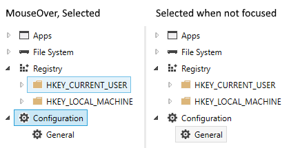
Curiosamente, cuando mi versión no tiene el foco, se ve bastante bien:
Me gustaría abstenerme de redefinir la plantilla de control como se shown aquí o here . Quiero establecer las propiedades mínimas requeridas para que el elemento seleccionado se vea en Explorer.
Alternativa: También me gustaría que el elemento seleccionado seleccionado se parezca al mío ahora cuando no tiene el foco. Al perder el foco, el color debería cambiar de azul a gris.
Aquí está mi código:
<TreeView
    x:Name="TreeView"
    ItemsSource="{Binding TopLevelNodes}"
    VirtualizingStackPanel.IsVirtualizing="True"
    VirtualizingStackPanel.VirtualizationMode="Recycling">

    <TreeView.ItemContainerStyle>
        <Style TargetType="{x:Type TreeViewItem}">
            <Setter Property="IsExpanded" Value="{Binding IsExpanded, Mode=TwoWay}" />
            <Setter Property="IsSelected" Value="{Binding IsSelected, Mode=TwoWay}" />

            <Style.Triggers>
                <Trigger Property="IsSelected" Value="True">
                    <Setter Property="BorderBrush" Value="#FF7DA2CE" />
                    <Setter Property="Background" Value="#FFCCE2FC" />
                </Trigger>
            </Style.Triggers>
        </Style>
    </TreeView.ItemContainerStyle>

    <TreeView.Resources>
        <HierarchicalDataTemplate DataType="{x:Type viewmodels:ObjectBaseViewModel}" ItemsSource="{Binding Children}">
            <Border Name="ItemBorder" CornerRadius="2" Background="{Binding Background, RelativeSource={RelativeSource AncestorType=TreeViewItem}}"
                      BorderBrush="{Binding BorderBrush, RelativeSource={RelativeSource AncestorType=TreeViewItem}}" BorderThickness="1">
                <StackPanel Orientation="Horizontal" Margin="2">
                    <Image Name="icon" Source="/ExplorerTreeView/Images/folder.png"/>
                    <TextBlock Text="{Binding Name}"/>
                </StackPanel>
            </Border>
        </HierarchicalDataTemplate>
    </TreeView.Resources>
</TreeView>
Solución
Con las excelentes respuestas de Sheridan y Meleak, mi TreeView ahora se ve así en código (un resultado con el que estoy muy contento y que está muy cerca del estilo de Explorer):
<TreeView
...
    <TreeView.ItemContainerStyle>
        <Style TargetType="{x:Type TreeViewItem}">
            <!-- Style for the selected item -->
            <Setter Property="BorderThickness" Value="1"/>
            <Style.Triggers>
                <!-- Selected and has focus -->
                <Trigger Property="IsSelected" Value="True">
                    <Setter Property="BorderBrush" Value="#7DA2CE"/>
                </Trigger>
                <!-- Mouse over -->
                <Trigger Property="helpers:TreeView_IsMouseDirectlyOverItem.IsMouseDirectlyOverItem" Value="True">
                    <Setter Property="Background">
                        <Setter.Value>
                            <LinearGradientBrush EndPoint="0,1" StartPoint="0,0">
                                <GradientStop Color="#FFFAFBFD" Offset="0"/>
                                <GradientStop Color="#FFEBF3FD" Offset="1"/>
                            </LinearGradientBrush>
                        </Setter.Value>
                    </Setter>
                    <Setter Property="BorderBrush" Value="#B8D6FB"/>
                </Trigger>
                <!-- Selected but does not have the focus -->
                <MultiTrigger>
                    <MultiTrigger.Conditions>
                        <Condition Property="IsSelected" Value="True"/>
                        <Condition Property="IsSelectionActive" Value="False"/>
                    </MultiTrigger.Conditions>
                    <Setter Property="BorderBrush" Value="#D9D9D9"/>
                </MultiTrigger>
            </Style.Triggers>
            <Style.Resources>
                <Style TargetType="Border">
                    <Setter Property="CornerRadius" Value="2"/>
                </Style>
            </Style.Resources>
        </Style>
    </TreeView.ItemContainerStyle>

    <TreeView.Resources>
        <HierarchicalDataTemplate DataType="{x:Type viewmodels:ObjectBaseViewModel}" ItemsSource="{Binding Children}">
            <StackPanel Orientation="Horizontal" Margin="2,1,5,2">
                <Grid Margin="0,0,3,0">
                    <Image Name="icon" Source="/ExplorerTreeView/Images/folder.png"/>
                </Grid>
                <TextBlock Text="{Binding Name}" />
            </StackPanel>
        </HierarchicalDataTemplate>

        <!-- Brushes for the selected item -->
        <LinearGradientBrush x:Key="{x:Static SystemColors.HighlightBrushKey}" EndPoint="0,1" StartPoint="0,0">
            <GradientStop Color="#FFDCEBFC" Offset="0"/>
            <GradientStop Color="#FFC1DBFC" Offset="1"/>
        </LinearGradientBrush>
        <LinearGradientBrush x:Key="{x:Static SystemColors.ControlBrushKey}" EndPoint="0,1" StartPoint="0,0">
            <GradientStop Color="#FFF8F8F8" Offset="0"/>
            <GradientStop Color="#FFE5E5E5" Offset="1"/>
        </LinearGradientBrush>
        <SolidColorBrush x:Key="{x:Static SystemColors.HighlightTextBrushKey}" Color="Black" />
        <SolidColorBrush x:Key="{x:Static SystemColors.ControlTextBrushKey}" Color="Black" />
    </TreeView.Resources>
</TreeView>
Estilo de Windows 10 TreeView (y ListView)
Originalmente estaba buscando una forma de aplicar el esquema de color de Windows 10 a TreeViewItem, que incluye
- IsMouseOver solo en el elemento actual
- Los colores de Windows 10 que WPF ya los aplica a ListBox (no a Windows Explorer)
Si alguno de ustedes está buscando exactamente esto, siéntanse libres de tomar el siguiente código. Utilicé la solución de Helge Klein para el problema IsMouseOver y apliqué los colores de Windows 10 al XAML. Por lo tanto, propongo esto como una adición a la respuesta aceptada.
Además, vea a continuación una palabra sobre ListView y ComboBox también.
Captura de pantalla
App.xaml
<Style TargetType="{x:Type TreeView}">
    <Style.Resources>
        <SolidColorBrush x:Key="{x:Static SystemColors.HighlightBrushKey}" Color="#CBE8F6" />
        <SolidColorBrush x:Key="{x:Static SystemColors.InactiveSelectionHighlightBrushKey}" Color="#F6F6F6" />
        <SolidColorBrush x:Key="{x:Static SystemColors.HighlightTextBrushKey}" Color="Black" />
        <SolidColorBrush x:Key="{x:Static SystemColors.ControlTextBrushKey}" Color="Black" />
    </Style.Resources>
</Style>
<Style TargetType="{x:Type TreeViewItem}">
    <Setter Property="BorderThickness" Value="1" />
    <Style.Triggers>
        <Trigger Property="IsSelected" Value="True">
            <Setter Property="BorderBrush" Value="#26A0DA" />
        </Trigger>
        <MultiTrigger>
            <MultiTrigger.Conditions>
                <Condition Property="local:TreeViewItemHelper.IsMouseDirectlyOverItem" Value="True" />
                <Condition Property="IsSelected" Value="False" />
            </MultiTrigger.Conditions>
            <Setter Property="Background" Value="#E5F3FB" />
            <Setter Property="BorderBrush" Value="#70C0E7" />
        </MultiTrigger>
        <MultiTrigger>
            <MultiTrigger.Conditions>
                <Condition Property="IsSelected" Value="True" />
                <Condition Property="IsSelectionActive" Value="False" />
            </MultiTrigger.Conditions>
            <Setter Property="BorderBrush" Value="#DADADA" />
        </MultiTrigger>
    </Style.Triggers>
</Style>
TreeViewItemHelper ( blogs.msdn.com/b/mikehillberg/archive/2006/09/21/… publicada por Helge Klein, cambios menores / simplificación )
public static class TreeViewItemHelper
{
    private static TreeViewItem CurrentItem;
    private static readonly RoutedEvent UpdateOverItemEvent = EventManager.RegisterRoutedEvent("UpdateOverItem", RoutingStrategy.Bubble, typeof(RoutedEventHandler), typeof(TreeViewItemHelper));
    private static readonly DependencyPropertyKey IsMouseDirectlyOverItemKey = DependencyProperty.RegisterAttachedReadOnly("IsMouseDirectlyOverItem", typeof(bool), typeof(TreeViewItemHelper), new FrameworkPropertyMetadata(null, new CoerceValueCallback(CalculateIsMouseDirectlyOverItem)));
    public static readonly DependencyProperty IsMouseDirectlyOverItemProperty = IsMouseDirectlyOverItemKey.DependencyProperty;

    static TreeViewItemHelper()
    {
        EventManager.RegisterClassHandler(typeof(TreeViewItem), UIElement.MouseEnterEvent, new MouseEventHandler(OnMouseTransition), true);
        EventManager.RegisterClassHandler(typeof(TreeViewItem), UIElement.MouseLeaveEvent, new MouseEventHandler(OnMouseTransition), true);
        EventManager.RegisterClassHandler(typeof(TreeViewItem), UpdateOverItemEvent, new RoutedEventHandler(OnUpdateOverItem));
    }
    public static bool GetIsMouseDirectlyOverItem(DependencyObject obj)
    {
        return (bool)obj.GetValue(IsMouseDirectlyOverItemProperty);
    }
    private static object CalculateIsMouseDirectlyOverItem(DependencyObject item, object value)
    {
        return item == CurrentItem;
    }
    private static void OnUpdateOverItem(object sender, RoutedEventArgs e)
    {
        CurrentItem = sender as TreeViewItem;
        CurrentItem.InvalidateProperty(IsMouseDirectlyOverItemProperty);
        e.Handled = true;
    }
    private static void OnMouseTransition(object sender, MouseEventArgs e)
    {
        lock (IsMouseDirectlyOverItemProperty)
        {
            if (CurrentItem != null)
            {
                DependencyObject oldItem = CurrentItem;
                CurrentItem = null;
                oldItem.InvalidateProperty(IsMouseDirectlyOverItemProperty);
            }

            Mouse.DirectlyOver?.RaiseEvent(new RoutedEventArgs(UpdateOverItemEvent));
        }
    }
}
ListBox / ListView y ComboBox: en Windows 7 (y 8?) , Esto hará que el diseño de TreeView a ListBox / ListView y ComboBox difiera. Por lo tanto, si también desea aplicar este esquema de color a estos tipos de controles, use esto:
<Style TargetType="{x:Type ListBoxItem}">
    <Setter Property="Template">
        <Setter.Value>
            <ControlTemplate TargetType="{x:Type ListBoxItem}">
                <Border Name="Border" BorderThickness="1" Background="Transparent">
                    <ContentPresenter />
                </Border>
                <ControlTemplate.Triggers>
                    <Trigger Property="IsMouseOver" Value="True">
                        <Setter TargetName="Border" Property="Background" Value="#E5F3FB" />
                        <Setter TargetName="Border" Property="BorderBrush" Value="#70C0E7" />
                    </Trigger>
                    <Trigger Property="IsSelected" Value="True">
                        <Setter TargetName="Border" Property="Background" Value="#CBE8F6" />
                        <Setter TargetName="Border" Property="BorderBrush" Value="#26A0DA" />
                    </Trigger>
                    <MultiTrigger>
                        <MultiTrigger.Conditions>
                            <Condition Property="IsSelected" Value="True" />
                            <Condition Property="Selector.IsSelectionActive" Value="False" />
                        </MultiTrigger.Conditions>
                        <Setter TargetName="Border" Property="Background" Value="#F6F6F6" />
                        <Setter TargetName="Border" Property="BorderBrush" Value="#DADADA" />
                    </MultiTrigger>
                </ControlTemplate.Triggers>
            </ControlTemplate>
        </Setter.Value>
    </Setter>
</Style>
<Style TargetType="{x:Type ListViewItem}" BasedOn="{StaticResource {x:Type ListBoxItem}}" />
<Style TargetType="{x:Type ComboBoxItem}">
    <Setter Property="Template">
        <Setter.Value>
            <ControlTemplate TargetType="{x:Type ComboBoxItem}">
                <Border Name="Border" BorderThickness="1" Padding="1" Background="Transparent">
                    <ContentPresenter />
                </Border>
                <ControlTemplate.Triggers>
                    <Trigger Property="IsMouseOver" Value="True">
                        <Setter TargetName="Border" Property="Background" Value="#E5F3FB" />
                        <Setter TargetName="Border" Property="BorderBrush" Value="#70C0E7" />
                    </Trigger>
                    <Trigger Property="IsSelected" Value="True">
                        <Setter TargetName="Border" Property="Background" Value="#CBE8F6" />
                        <Setter TargetName="Border" Property="BorderBrush" Value="#26A0DA" />
                    </Trigger>
                </ControlTemplate.Triggers>
            </ControlTemplate>
        </Setter.Value>
    </Setter>
</Style>
Añada esto a su TreeView.ContainerStyle para eliminar el fondo blue predeterminado.
<Style.Resources>
    <SolidColorBrush x:Key="{x:Static SystemColors.HighlightBrushKey}" Color="Transparent" />
    <SolidColorBrush x:Key="{x:Static SystemColors.ControlBrushKey}" Color="Transparent" />
    <SolidColorBrush x:Key="{x:Static SystemColors.HighlightTextBrushKey}" Color="Black" />
    <SolidColorBrush x:Key="{x:Static SystemColors.ControlTextBrushKey}" Color="Black" />
</Style.Resources>
Puede reemplazar el Black con el color que desee que sea el texto del elemento y el texto del elemento seleccionado.
Para tener un fondo gris cuando no está enfocado, puede configurar un Style "no enfocado" con un fondo gris y usar EventTrigger s en los eventos TreeViewItem.GotFocus y LostFocus para alternar entre los Style .
EDITAR >>>
Si quieres ser flash, puedes usar animaciones para cambiar entre los colores de fondo agregando activadores a tu ItemBorder Border directamente en tu HierarchicalDataTemplate manera:
<Border.Triggers>
    <EventTrigger RoutedEvent="Border.GotFocus">
        <EventTrigger.Actions>
            <BeginStoryboard>
                <Storyboard>
                    <ColorAnimation Storyboard.TargetProperty="(Border.Background).(SolidColorBrush.Color)" To="YourColour" Duration="0:0:0.2" />
                </Storyboard>
            </BeginStoryboard>
        </EventTrigger.Actions>
    </EventTrigger>
    <EventTrigger RoutedEvent="Border.LostFocus">
        <EventTrigger.Actions>
            <BeginStoryboard>
                <Storyboard>
                    <ColorAnimation Storyboard.TargetProperty="(Border.Background).(SolidColorBrush.Color)" To="LightGray" Duration="0:0:0.2" />
                </Storyboard>
            </BeginStoryboard>
        </EventTrigger.Actions>
    </EventTrigger>
</Border.Triggers>
Tenga en cuenta que esto solo funcionará si ColorAnimation tiene un color From . A medida que este código permanece, el tiempo de ejecución buscará un conjunto de SolidColorBrush en la propiedad Border.Background , por lo que debe establecer uno. En su lugar, podría establecer la propiedad ColorAnimation.From directamente.
Añadiendo a la respuesta de @ Sheridan
Esto no es 100% exacto, pero debería acercarlo bastante (está usando los colores de GridView que es bastante parecido al Explorador de Windows)
<TreeView ...>
    <TreeView.Resources>
        <LinearGradientBrush x:Key="{x:Static SystemColors.HighlightBrushKey}" EndPoint="0,1" StartPoint="0,0">
            <GradientStop Color="#FFD9F4FF" Offset="0"/>
            <GradientStop Color="#FF9BDDFB" Offset="1"/>
        </LinearGradientBrush>
        <LinearGradientBrush x:Key="{x:Static SystemColors.ControlBrushKey}" EndPoint="0,1" StartPoint="0,0">
            <GradientStop Color="#FFEEEDED" Offset="0"/>
            <GradientStop Color="#FFDDDDDD" Offset="1"/>
        </LinearGradientBrush>
        <SolidColorBrush x:Key="{x:Static SystemColors.HighlightTextBrushKey}" Color="Black" />
        <SolidColorBrush x:Key="{x:Static SystemColors.ControlTextBrushKey}" Color="Black" />
    </TreeView.Resources>
    <TreeView.ItemContainerStyle>
        <Style TargetType="{x:Type TreeViewItem}">
            <Setter Property="BorderThickness" Value="1.5"/>
            <Style.Triggers>
                <Trigger Property="IsSelected" Value="True">
                    <Setter Property="BorderBrush" Value="#adc6e5"/>
                </Trigger>
                <MultiTrigger>
                    <MultiTrigger.Conditions>
                        <Condition Property="IsSelected" Value="True"/>
                        <Condition Property="IsSelectionActive" Value="False"/>
                    </MultiTrigger.Conditions>
                    <Setter Property="BorderBrush" Value="LightGray"/>
                </MultiTrigger>
            </Style.Triggers>
            <Style.Resources>
                <Style TargetType="Border">
                    <Setter Property="CornerRadius" Value="2"/>
                </Style>
            </Style.Resources>
        </Style>
    </TreeView.ItemContainerStyle>
</TreeView>