javascript - efecto wave css
Cómo crear efecto Ripple en Click-Material Design (8)
Soy nuevo en las animaciones de CSS y he estado tratando de hacer que su animación funcione durante las últimas horas mirando su código, pero no puedo hacerlo funcionar por el momento.
Estoy hablando de este efecto: https://angular.io/ (efecto de menú). Básicamente, se trata de una animación al hacer clic que extiende un círculo desde el cursor del mouse.
Parece que se reduce a estas 2 líneas:
transition: box-shadow .4s cubic-bezier(.25,.8,.25,1),background-color .4s cubic-bezier(.25,.8,.25,1),-webkit-transform .4s cubic-bezier(.25,.8,.25,1);
transition: box-shadow .4s cubic-bezier(.25,.8,.25,1),background-color .4s cubic-bezier(.25,.8,.25,1),transform .4s cubic-bezier(.25,.8,.25,1);
PD: Quizás haya algo de jQuery que no haya visto.
Efecto Ripple en Material Design usando jQuery y CSS3
Para crear un efecto UX Ripple, básicamente necesitas:
- añadir a cualquier elemento un
oveflow:hiddenelementooveflow:hiddenpara contener el círculooveflow:hidden(no desea alterar el desbordamiento del elemento original, ni ver el efecto dominó fuera del contenedor deseado) - Anexar al contenedor de desbordamiento el elemento radial translúcido de onda ondulada
- obtener las coordenadas de clic y CSS3 animar la escala y la opacidad del elemento de ondulación
- Escuche el evento
animationendy destruya el contenedor de ondas .
El código básico:
Básicamente agrega data-ripple (predeterminado como rizado blanco) o data-ripple="#000" a un elemento deseado:
<a data-ripple> EDIT </a>
<div data-ripple="rgba(0,0,0, 0.3)">Lorem ipsum</div>
CSS:
/* MAD-RIPPLE EFFECT */
.ripple{
  position: absolute;
  top:0; left:0; bottom:0; right:0;
  overflow: hidden;
  -webkit-transform: translateZ(0); /* to contain zoomed ripple */
  transform: translateZ(0);
  border-radius: inherit; /* inherit from parent (rounded buttons etc) */
  pointer-events: none; /* allow user interaction */
          animation: ripple-shadow 0.4s forwards;
  -webkit-animation: ripple-shadow 0.4s forwards;
}
.rippleWave{
  backface-visibility: hidden;
  position: absolute;
  border-radius: 50%;
  transform: scale(0.7); -webkit-transform: scale(0.7);
  background: rgba(255,255,255, 1);
  opacity: 0.45;
          animation: ripple 2s forwards;
  -webkit-animation: ripple 2s forwards;
}
@keyframes ripple-shadow {
  0%   {box-shadow: 0 0 0 rgba(0,0,0,0.0);}
  20%  {box-shadow: 0 4px 16px rgba(0,0,0,0.3);}
  100% {box-shadow: 0 0 0 rgba(0,0,0,0.0);}
}
@-webkit-keyframes ripple-shadow {
  0%   {box-shadow: 0 0 0 rgba(0,0,0,0.0);}
  20%  {box-shadow: 0 4px 16px rgba(0,0,0,0.3);}
  100% {box-shadow: 0 0 0 rgba(0,0,0,0.0);}
}
@keyframes ripple {
  to {transform: scale(24); opacity:0;}
}
@-webkit-keyframes ripple {
  to {-webkit-transform: scale(24); opacity:0;}
}
jQuery
jQuery(function($) {

  // MAD-RIPPLE // (jQ+CSS)
  $(document).on("mousedown", "[data-ripple]", function(e) {

    var $self = $(this);

    if($self.is(".btn-disabled")) {
      return;
    }
    if($self.closest("[data-ripple]")) {
      e.stopPropagation();
    }

    var initPos = $self.css("position"),
        offs = $self.offset(),
        x = e.pageX - offs.left,
        y = e.pageY - offs.top,
        dia = Math.min(this.offsetHeight, this.offsetWidth, 100), // start diameter
        $ripple = $(''<div/>'', {class : "ripple",appendTo : $self });

    if(!initPos || initPos==="static") {
      $self.css({position:"relative"});
    }

    $(''<div/>'', {
      class : "rippleWave",
      css : {
        background: $self.data("ripple"),
        width: dia,
        height: dia,
        left: x - (dia/2),
        top: y - (dia/2),
      },
      appendTo : $ripple,
      one : {
        animationend : function(){
          $ripple.remove();
        }
      }
    });
  });

});
Aquí hay una demostración con todas las funciones:
jQuery(function($) {

  // MAD-RIPPLE // (jQ+CSS)
  $(document).on("mousedown", "[data-ripple]", function(e) {

    var $self = $(this);

    if($self.is(".btn-disabled")) {
      return;
    }
    if($self.closest("[data-ripple]")) {
      e.stopPropagation();
    }

    var initPos = $self.css("position"),
        offs = $self.offset(),
        x = e.pageX - offs.left,
        y = e.pageY - offs.top,
        dia = Math.min(this.offsetHeight, this.offsetWidth, 100), // start diameter
        $ripple = $(''<div/>'', {class : "ripple",appendTo : $self });

    if(!initPos || initPos==="static") {
      $self.css({position:"relative"});
    }

    $(''<div/>'', {
      class : "rippleWave",
      css : {
        background: $self.data("ripple"),
        width: dia,
        height: dia,
        left: x - (dia/2),
        top: y - (dia/2),
      },
      appendTo : $ripple,
      one : {
        animationend : function(){
          $ripple.remove();
        }
      }
    });
  });

});
*{box-sizing:border-box; -webkit-box-sizing:border-box;}
html, body{height:100%; margin:0;}
body{background:#f5f5f5; font: 14px/20px Roboto, sans-serif;}
h1, h2{font-weight: 300;}


/* MAD-RIPPLE EFFECT */
.ripple{
  position: absolute;
  top:0; left:0; bottom:0; right:0;
  overflow: hidden;
  -webkit-transform: translateZ(0); /* to contain zoomed ripple */
  transform: translateZ(0);
  border-radius: inherit; /* inherit from parent (rounded buttons etc) */
  pointer-events: none; /* allow user interaction */
          animation: ripple-shadow 0.4s forwards;
  -webkit-animation: ripple-shadow 0.4s forwards;
}
.rippleWave{
  backface-visibility: hidden;
  position: absolute;
  border-radius: 50%;
  transform: scale(0.7); -webkit-transform: scale(0.7);
  background: rgba(255,255,255, 1);
  opacity: 0.45;
          animation: ripple 2s forwards;
  -webkit-animation: ripple 2s forwards;
}
@keyframes ripple-shadow {
  0%   {box-shadow: 0 0 0 rgba(0,0,0,0.0);}
  20%  {box-shadow: 0 4px 16px rgba(0,0,0,0.3);}
  100% {box-shadow: 0 0 0 rgba(0,0,0,0.0);}
}
@-webkit-keyframes ripple-shadow {
  0%   {box-shadow: 0 0 0 rgba(0,0,0,0.0);}
  20%  {box-shadow: 0 4px 16px rgba(0,0,0,0.3);}
  100% {box-shadow: 0 0 0 rgba(0,0,0,0.0);}
}
@keyframes ripple {
  to {transform: scale(24); opacity:0;}
}
@-webkit-keyframes ripple {
  to {-webkit-transform: scale(24); opacity:0;}
}


/* MAD-BUTTONS (demo) */
[class*=mad-button-]{
  display:inline-block;
  text-align:center;
  position: relative;
  margin: 0;
  white-space: nowrap;
  vertical-align: middle;
  font-family: "Roboto", sans-serif;
  font-size: 14px;
  font-weight: 500;
  text-transform: uppercase;
  text-decoration: none;
  border: 0; outline: 0;
  background: none;
  transition: 0.3s;
  cursor: pointer;
  color: rgba(0,0,0, 0.82);
}
[class*=mad-button-] i.material-icons{
  vertical-align:middle;
  padding:0;
}
.mad-button-raised{
  height: 36px;
  padding: 0px 16px;
  line-height: 36px;
  border-radius: 2px;
  box-shadow: /*amb*/ 0 0   2px rgba(0,0,0,0.15),
    /*key*/ 0 1px 3px rgba(0,0,0,0.25);
}.mad-button-raised:hover{
  box-shadow: /*amb*/ 0 0   2px rgba(0,0,0,0.13),
    /*key*/ 0 2px 4px rgba(0,0,0,0.2);
}
.mad-button-action{
  width: 56px; height:56px;
  padding: 16px 0;
  border-radius: 32px;
  box-shadow: /*amb*/ 0 0   2px rgba(0,0,0,0.13),
    /*key*/ 0 5px 7px rgba(0,0,0,0.2);
}.mad-button-action:hover{
  box-shadow: /*amb*/ 0 0   2px rgba(0,0,0,0.11),
    /*key*/ 0 6px 9px rgba(0,0,0,0.18);
}
[class*=mad-button-].mad-ico-left  i.material-icons{ margin: 0 8px 0 -4px; }
[class*=mad-button-].mad-ico-right i.material-icons{ margin: 0 -4px 0 8px; }

/* MAD-COLORS */
.bg-primary-darker{background:#1976D2; color:#fff;}
.bg-primary{ background:#2196F3; color:#fff; }
.bg-primary.lighter{ background: #BBDEFB; color: rgba(0,0,0,0.82);}
.bg-accented{ background:#FF4081; color:#fff; }

/* MAD-CELL */
.cell{padding: 8px 16px; overflow:auto;}
<link href=''https://fonts.googleapis.com/css?family=Roboto:500,400,300&subset=latin,latin-ext'' rel=''stylesheet'' type=''text/css''>
<link href="https://fonts.googleapis.com/icon?family=Material+Icons" rel="stylesheet">
<script src="https://code.jquery.com/jquery-2.1.4.js"></script>
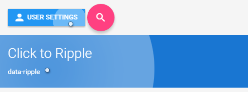
<div class="cell">
<button data-ripple class="mad-button-raised mad-ico-left bg-primary"><i class="material-icons">person</i>User settings</button>
<a data-ripple href="#" class="mad-button-action bg-accented"><i class="material-icons">search</i></a>
</div>
<div data-ripple class="cell bg-primary-darker">
<h1>Click to Ripple</h1>
<p>data-ripple</p>
</div>
<div data-ripple="rgba(0,0,0, 0.4)" class="cell bg-primary">
<p>data-ripple="rgba(0,0,0, 0.4)"</p>
<p> Lorem ipsum dolor sit amet, consectetur adipisicing elit, sed do eiusmod tempor incididunt ut labore....</p>
<p><a data-ripple class="mad-button-raised mad-ico-right bg-accented">Edit<i class="material-icons">edit</i></a></p>
</div>
Aquí está el componente del botón Material Design "El efecto de la onda" Hecho Uso de CSS3 puro y JavaScript sin bibliotecas sin marco Componente del botón Material Design "The wave effect"
https://codepen.io/Mahmoud-Zakaria/pen/NvbORQ
HTML
<div class="md" >Click</div>
CSS
@keyframes glow-out {
  30%,80% {
   transform: scale(7);
 }
  100% {
   opacity: 0;
 }
}

.md {
 --y: 0;
 --x: 0;
display: inline-block;
padding: 20px 70px;
text-align: center;
background-color: lightcoral;
margin: 5em;
position: relative;
overflow: hidden;
cursor: pointer;
border-radius: 4px;
color: white;
}


.is-clicked {
  content: '''';
  position: absolute;
  top: calc(var(--y) * 1px);
  left: calc(var(--x) * 1px);
  width: 100px;
  height:100px;
  background: rgba(255, 255, 255, .3);
  border-radius: 50%;
  animation: glow-out 1s ease-in-out forwards;
  transform: translate(-50%, -50%);
 }
JS
// Material Design button Module
 let md_module = (function() {

 let btn = document.querySelectorAll(".md");
 let md_btn = Array.prototype.slice.call(btn);

  md_btn.forEach(eachCB)

 function eachCB (item, index, array){

  function md(e) {
     let offsetX = e.clientX - item.offsetLeft;
     let offsetY = e.clientY - item.offsetTop;
     item.style.setProperty("--x", offsetX);
     item.style.setProperty("--y", offsetY);
     item.innerHTML += ''<div class="is-clicked"></div>'';
   }

function rm() {
  let state = item.querySelectorAll(".is-clicked");
  console.log(state)
  for (let i = 0; i < state.length; i++) {
    if (state[i].className === "is-clicked") {
      state[i].remove();
    }
  }
}

item.addEventListener("click", md);
item.addEventListener("animationend", rm);
}

 })();
Aquí hay una implementación de solo CSS, es decir, no se requiere javascript.
Fuente: https://ghinda.net/article/css-ripple-material-design/
body {
  background: #fff;
}

button {
  position: relative;
  overflow: hidden;
  padding: 16px 32px;
}

button:after {
  content: '''';
  display: block;
  position: absolute;
  left: 50%;
  top: 50%;
  width: 120px;
  height: 120px;
  margin-left: -60px;
  margin-top: -60px;
  background: #3f51b5;
  border-radius: 100%;
  opacity: .6;

  transform: scale(0);
}

@keyframes ripple {
  0% {
    transform: scale(0);
  }
  20% {
    transform: scale(1);
  }
  100% {
    opacity: 0;
    transform: scale(1);
  }
}

button:not(:active):after {
  animation: ripple 1s ease-out;
}

/* fixes initial animation run, without user input, on page load.
 */
button:after {
  visibility: hidden;
}

button:focus:after {
  visibility: visible;
}
<button>
  Button
</button>
Esto se puede lograr con cajas de sombras. El posicionamiento del origen del círculo debajo del mouse cuando se hace clic necesitará JS.
li{
    font-size:2em;
    background:rgba(51, 51, 254, 0.8);
    list-style-type:none;
    display:inline-block;
    line-height:2em;
    width:6em;
    text-align:center;
    color:#fff;
    position:relative;
    overflow:hidden;
}
a{color:#fff;}
a:after{
    content:'''';
    position:absolute;
    border-radius:50%;
    height:10em; width:10em;
    top: -4em; left:-2em;
    box-shadow: inset 0 0 0 5em rgba(255,255,255,0.2);
    transition: box-shadow 0.8s;
}
a:focus:after{
    box-shadow: inset 0 0 0 0em rgba(255,255,255,0.2);
}
<ul>
    <li><a href="#">button</a></li>
</ul>
He utilizado este tipo de código antes en algunos de mis proyectos.
Usando jQuery podemos ubicar el efecto no solo estático y luego agregamos el elemento span onclick . He agregado comentarios por lo que es más fácil de seguir.
jQuery
$("div").click(function (e) {

  // Remove any old one
  $(".ripple").remove();

  // Setup
  var posX = $(this).offset().left,
      posY = $(this).offset().top,
      buttonWidth = $(this).width(),
      buttonHeight =  $(this).height();

  // Add the element
  $(this).prepend("<span class=''ripple''></span>");


 // Make it round!
  if(buttonWidth >= buttonHeight) {
    buttonHeight = buttonWidth;
  } else {
    buttonWidth = buttonHeight;
  }

  // Get the center of the element
  var x = e.pageX - posX - buttonWidth / 2;
  var y = e.pageY - posY - buttonHeight / 2;


  // Add the ripples CSS and start the animation
  $(".ripple").css({
    width: buttonWidth,
    height: buttonHeight,
    top: y + ''px'',
    left: x + ''px''
  }).addClass("rippleEffect");
});
CSS
.ripple {
  width: 0;
  height: 0;
  border-radius: 50%;
  background: rgba(255, 255, 255, 0.4);
  transform: scale(0);
  position: absolute;
  opacity: 1;
}
.rippleEffect {
    animation: rippleDrop .6s linear;
}

@keyframes rippleDrop {
  100% {
    transform: scale(2);
    opacity: 0;
  }
}
Puede obtener el mismo efecto con la ayuda de Materialise css , por lo que es bastante fácil. Todo lo que tienes que hacer es agregar una clase a donde quieras el efecto.
<a href="#" class="btn waves-effect waves-light">Submit</a>
Si quieres ir con CSS puro, revisa este código: Efecto Ripple
Puede usar http://mladenplavsic.github.io/css-ripple-effect/ Solución de CSS puro
<link href="https://cdn.rawgit.com/mladenplavsic/css-ripple-effect/35c35541/dist/ripple.min.css" rel="stylesheet"/>

<button class="ripple">Click me</button>
Realización javascript + babel -
javascript -
class ImpulseStyleFactory {
    static ANIMATION_DEFAULT_DURATION = 1;
    static ANIMATION_DEFAULT_SIZE = 300;
    static ANIMATION_RATIO = ImpulseStyleFactory.ANIMATION_DEFAULT_DURATION / ImpulseStyleFactory.ANIMATION_DEFAULT_SIZE;

    static circleImpulseStyle( x, y, size, color = `#fff`, duration = 1 ){
        return {
            width: `${ size }px`,
            height: `${ size }px`,

            background: color,

            borderRadius: `50%`,

            display: `inline-block`,

            pointerEvents: `none`,

            position: `absolute`,

            top: `${ y - size / 2 }px`,
            left: `${ x - size / 2 }px`,

            animation: `impulse ${ duration }s`,
        };
    }
}


class Impulse {
    static service = new Impulse();


    static install( container ) {
        Impulse.service.containerRegister( container );
    }
    static destroy( container ){
        Impulse.service.containerUnregister( container );
    }

    static applyToElement( {x, y}, container ){
        Impulse.service.createImpulse( x, y, container );
    }

    constructor(){
        this.impulse_clickHandler = this.impulse_clickHandler.bind(this);
        this.impulse_animationEndHandler = this.impulse_animationEndHandler.bind(this);

        this.actives = new Map();
    }

    containerRegister( container ){
        container.addEventListener(''click'', this.impulse_clickHandler);
    }
    containerUnregister( container ){
        container.removeEventListener(''click'', this.impulse_clickHandler);
    }

    createImpulse( x, y, container ){
        let { clientWidth, clientHeight } = container;

        let impulse = document.createElement(''div'');
        impulse.addEventListener(''animationend'', this.impulse_animationEndHandler);

        let size = Math.max( clientWidth, clientHeight ) * 2;
        let color = container.dataset.color;

        Object.assign(impulse.style, ImpulseStyleFactory.circleImpulseStyle(
            x, y, size, color
        ));

        if( this.actives.has( container ) ){
            this.actives.get( container )
                        .add( impulse );
        }else{
            this.actives.set( container, new Set( [ impulse ] ) );
        }

        container.dataset.active = true;

        container.appendChild( impulse );
    }


    impulse_clickHandler({ layerX, layerY, currentTarget: container }){
        this.createImpulse( layerX, layerY, container );
    }

    impulse_animationEndHandler( {currentTarget: impulse} ){
        let { parentNode: container  } = impulse;

        this.actives.get( container )
                    .delete( impulse );

        if( ! this.actives.get( container ).size ){
            this.actives.delete( container );

            container.dataset.active = false;
        }

        container.removeChild(impulse);
    }
}
css -
@keyframes impulse {
    from {
        opacity: .3;

        transform: scale(0);
    }
    to {
        opacity: 0;

        transform: scale(1);
    }
}
para usar eso -
html -
<div class="impulse" data-color="#3f1dcb" data-active="false">
    <div class="panel"></div>
</div>
javascript -
let impulses = document.querySelectorAll(''.impulse'');
let impulseAll = Array.from( impulses );

impulseAll.forEach( Impulse.install );
Ejemplo de vida Impulse.install (crear impulso en coords de clic, agregar evento de controlador de click ) -
class ImpulseStyleFactory {
    static ANIMATION_DEFAULT_DURATION = 1;
    static ANIMATION_DEFAULT_SIZE = 300;
    static ANIMATION_RATIO = ImpulseStyleFactory.ANIMATION_DEFAULT_DURATION / ImpulseStyleFactory.ANIMATION_DEFAULT_SIZE;

    static circleImpulseStyle( x, y, size, color = `#fff`, duration = 1 ){
        return {
            width: `${ size }px`,
            height: `${ size }px`,

            background: color,

            borderRadius: `50%`,

            display: `inline-block`,

            pointerEvents: `none`,

            position: `absolute`,

            top: `${ y - size / 2 }px`,
            left: `${ x - size / 2 }px`,

            animation: `impulse ${ duration }s`,
        };
    }
}


class Impulse {
    static service = new Impulse();


    static install( container ) {
        Impulse.service.containerRegister( container );
    }
    static destroy( container ){
        Impulse.service.containerUnregister( container );
    }

    static applyToElement( {x, y}, container ){
        Impulse.service.createImpulse( x, y, container );
    }

    constructor(){
        this.impulse_clickHandler = this.impulse_clickHandler.bind(this);
        this.impulse_animationEndHandler = this.impulse_animationEndHandler.bind(this);

        this.actives = new Map();
    }

    containerRegister( container ){
        container.addEventListener(''click'', this.impulse_clickHandler);
    }
    containerUnregister( container ){
        container.removeEventListener(''click'', this.impulse_clickHandler);
    }

    createImpulse( x, y, container ){
        let { clientWidth, clientHeight } = container;

        let impulse = document.createElement(''div'');
        impulse.addEventListener(''animationend'', this.impulse_animationEndHandler);

        let size = Math.max( clientWidth, clientHeight ) * 2;
        let color = container.dataset.color;

        Object.assign(impulse.style, ImpulseStyleFactory.circleImpulseStyle(
            x, y, size, color
        ));

        if( this.actives.has( container ) ){
            this.actives.get( container )
                .add( impulse );
        }else{
            this.actives.set( container, new Set( [ impulse ] ) );
        }

        container.dataset.active = true;

        container.appendChild( impulse );
    }


    impulse_clickHandler({ layerX, layerY, currentTarget: container }){
        this.createImpulse( layerX, layerY, container );
    }

    impulse_animationEndHandler( {currentTarget: impulse} ){
        let { parentNode: container  } = impulse;

        this.actives.get( container )
            .delete( impulse );

        if( ! this.actives.get( container ).size ){
            this.actives.delete( container );

            container.dataset.active = false;
        }

        container.removeChild(impulse);
    }
}


let impulses = document.querySelectorAll(''.impulse'');
let impulseAll = Array.from( impulses );

impulseAll.forEach( Impulse.install );
@import "https://cdnjs.cloudflare.com/ajax/libs/normalize/6.0.0/normalize.min.css";
/*@import url(''https://fonts.googleapis.com/css?family=Roboto+Mono'');*/

* {
    box-sizing: border-box;
}

html {
    font-family: ''Roboto Mono'', monospace;
}

body {
    width: 100%;
    height: 100%;

    margin: 0;

    position: absolute;


}

main {
    width: 100%;
    height: 100%;

    overflow: hidden;

    position: relative;
}


.container {
    position: absolute;

    top: 0;
    left: 0;
}

.centred {
    display: flex;

    justify-content: center;

    align-items: center;
}

.shadow-xs {
    box-shadow: rgba(0, 0, 0, 0.117647) 0px 1px 6px, rgba(0, 0, 0, 0.117647) 0px 1px 4px;
}
.sample-impulse {
    transition: all .5s;

    overflow: hidden;

    position: relative;
}
.sample-impulse[data-active="true"] {
    box-shadow: rgba(0, 0, 0, 0.156863) 0px 3px 10px, rgba(0, 0, 0, 0.227451) 0px 3px 10px;
}


.panel {
    width: 300px;
    height: 100px;

    background: #fff;
}


.panel__hidden-label {
    color: #fff;

    font-size: 2rem;
    font-weight: bold;

    pointer-events: none;

    z-index: 1;

    position: absolute;
}
.panel__default-label {
    pointer-events: none;

    z-index: 2;

    position: absolute;
}

.sample-impulse[data-active="true"] .panel__default-label {
    display: none;
}


@keyframes impulse {
    from {
        opacity: .3;

        transform: scale(0);
    }
    to {
        opacity: 0;

        transform: scale(1);
    }
}
<main class="centred">
    <div class="sample-impulse impulse centred shadow-xs" data-color="#3f1dcb" data-active="false">
        <div class="group centred">
            <div class="panel"></div>
            <span class="panel__hidden-label"></span>
            <span class="panel__default-label">click me</span>
        </div>
    </div>
</main>
Ejemplo de vida Impulse.applyToElement ( Impulse.applyToElement impulso configuradas por el usuario, no agregue el evento del controlador click ) -
class ImpulseStyleFactory {
    static ANIMATION_DEFAULT_DURATION = 1;
    static ANIMATION_DEFAULT_SIZE = 300;
    static ANIMATION_RATIO = ImpulseStyleFactory.ANIMATION_DEFAULT_DURATION / ImpulseStyleFactory.ANIMATION_DEFAULT_SIZE;

    static circleImpulseStyle( x, y, size, color = `#fff`, duration = 1 ){
        return {
            width: `${ size }px`,
            height: `${ size }px`,

            background: color,

            borderRadius: `50%`,

            display: `inline-block`,

            pointerEvents: `none`,

            position: `absolute`,

            top: `${ y - size / 2 }px`,
            left: `${ x - size / 2 }px`,

            animation: `impulse ${ duration }s`,
        };
    }
}


class Impulse {
    static service = new Impulse();


    static install( container ) {
        Impulse.service.containerRegister( container );
    }
    static destroy( container ){
        Impulse.service.containerUnregister( container );
    }

    static applyToElement( {x, y}, container ){
        Impulse.service.createImpulse( x, y, container );
    }

    constructor(){
        this.impulse_clickHandler = this.impulse_clickHandler.bind(this);
        this.impulse_animationEndHandler = this.impulse_animationEndHandler.bind(this);

        this.actives = new Map();
    }

    containerRegister( container ){
        container.addEventListener(''click'', this.impulse_clickHandler);
    }
    containerUnregister( container ){
        container.removeEventListener(''click'', this.impulse_clickHandler);
    }

    createImpulse( x, y, container ){
        let { clientWidth, clientHeight } = container;

        let impulse = document.createElement(''div'');
        impulse.addEventListener(''animationend'', this.impulse_animationEndHandler);

        let size = Math.max( clientWidth, clientHeight ) * 2;
        let color = container.dataset.color;

        Object.assign(impulse.style, ImpulseStyleFactory.circleImpulseStyle(
            x, y, size, color
        ));

        if( this.actives.has( container ) ){
            this.actives.get( container )
                .add( impulse );
        }else{
            this.actives.set( container, new Set( [ impulse ] ) );
        }

        container.dataset.active = true;

        container.appendChild( impulse );
    }


    impulse_clickHandler({ layerX, layerY, currentTarget: container }){
        this.createImpulse( layerX, layerY, container );
    }

    impulse_animationEndHandler( {currentTarget: impulse} ){
        let { parentNode: container  } = impulse;

        this.actives.get( container )
            .delete( impulse );

        if( ! this.actives.get( container ).size ){
            this.actives.delete( container );

            container.dataset.active = false;
        }

        container.removeChild(impulse);
    }
}


const generateRandomPointByRectdAll = ( { width, height }, length = 1 ) => {
    let result = [];

    while( length-- ){
        result.push( {
            x: Math.round( Math.random() * width ),
            y: Math.round( Math.random() * height )
        } );
    }

    return result;
};

const delayTask = ( task, delay ) => new Promise( ( resolve, reject ) => {
    let timeoutID = setTimeout( () => task( ), delay )
} );

document.addEventListener( ''click'', () => {
    const MAX_IMPULSE_DELAY_TIME = 5000;

    let container = document.querySelector(''.custom-impulse'');
    let pointAll = generateRandomPointByRectdAll( {
        width: container.clientWidth,
        height: container.clientHeight
    }, 5 );
    let taskAll = pointAll.map( point => () => Impulse.applyToElement( point, container ) );
    let delayTaskAll = taskAll.map( task => delayTask( task, Math.round( Math.random() * MAX_IMPULSE_DELAY_TIME ) ) );
} );
@import "https://cdnjs.cloudflare.com/ajax/libs/normalize/6.0.0/normalize.min.css";
/*@import url(''https://fonts.googleapis.com/css?family=Roboto+Mono'');*/

* {
    box-sizing: border-box;
}

html {
    font-family: ''Roboto Mono'', monospace;
}

body {
    width: 100%;
    height: 100%;

    margin: 0;

    position: absolute;


}

main {
    width: 100%;
    height: 100%;

    overflow: hidden;

    position: relative;
}

.container-fill {
    width: 100%;
    height: 100%;
}

.container {
    position: absolute;

    top: 0;
    left: 0;
}

.centred {
    display: flex;

    justify-content: center;

    align-items: center;
}


.custom-impulse {
    will-change: transform, opasity;

    position: absolute;
}


@keyframes impulse {
    from {
        opacity: .3;

        transform: scale(0);
    }
    to {
        opacity: 0;

        transform: scale(1);
    }
}
<main class="centred">
    <div class="custom-impulse container-fill centred" data-color="#3f1dcb" data-active="false">
        <span>click me</span>
    </div>
</main>