android - guide - Equivalente de diseño relativo en Flutter
flutter install (3)
Aquí hay otro ejemplo para mostrar cómo se pueden usar
Stack
junto con
Positioned
para que funcione como
RelativeLayout
.
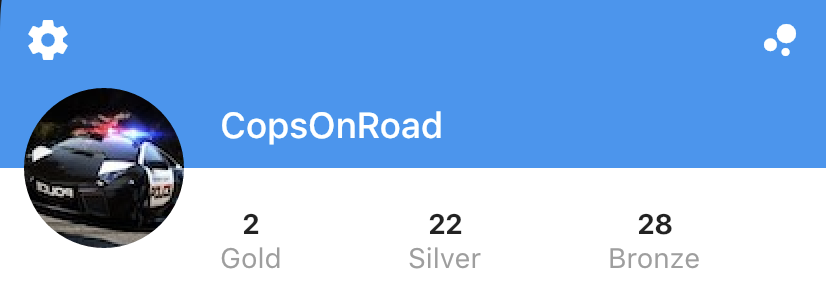
double _containerHeight = 120, _imageHeight = 80, _iconTop = 44, _iconLeft = 12, _marginLeft = 110;

@override
Widget build(BuildContext context) {
  return Scaffold(
    backgroundColor: Colors.white,
    body: Stack(
      children: <Widget>[
        Positioned(
          left: 0,
          right: 0,
          height: _containerHeight,
          child: Container(color: Colors.blue),
        ),
        Positioned(
          left: _iconLeft,
          top: _iconTop,
          child: Icon(Icons.settings, color: Colors.white),
        ),
        Positioned(
          right: _iconLeft,
          top: _iconTop,
          child: Icon(Icons.bubble_chart, color: Colors.white),
        ),
        Positioned(
          left: _iconLeft,
          top: _containerHeight - _imageHeight / 2,
          child: ClipOval(child: Image.asset("assets/images/profile.jpg", fit: BoxFit.cover, height: _imageHeight, width: _imageHeight)),
        ),
        Positioned(
          left: _marginLeft,
          top: _containerHeight - (_imageHeight / 2.5),
          child: Text("CopsOnRoad", style: TextStyle(color: Colors.white, fontWeight: FontWeight.w500, fontSize: 18)),
        ),
        Positioned.fill(
          left: _marginLeft,
          top: _containerHeight + (_imageHeight / 4),
          child: Row(
            mainAxisAlignment: MainAxisAlignment.spaceBetween,
            children: <Widget>[
              Column(
                children: <Widget>[
                  Text("2", style: TextStyle(fontWeight: FontWeight.bold)),
                  Text("Gold", style: TextStyle(color: Colors.grey)),
                ],
              ),
              Column(
                children: <Widget>[
                  Text("22", style: TextStyle(fontWeight: FontWeight.bold)),
                  Text("Silver", style: TextStyle(color: Colors.grey)),
                ],
              ),
              Column(
                children: <Widget>[
                  Text("28", style: TextStyle(fontWeight: FontWeight.bold)),
                  Text("Bronze", style: TextStyle(color: Colors.grey)),
                ],
              ),
              Container(),
            ],
          ),
        ),
      ],
    ),
  );
}
¿Hay alguna manera de implementar algo similar a lo que
RelativeLayout
hace en Android?
En particular, estoy buscando algo similar a
centerInParent
,
layout_below:<layout_id>
,
layout_above:<layout_id>
y
alignParentLeft
Para obtener más información sobre RelativeLayout: https://developer.android.com/reference/android/widget/RelativeLayout.LayoutParams.html
EDITAR: aquí hay un ejemplo de un diseño basado en
RelativeLayout
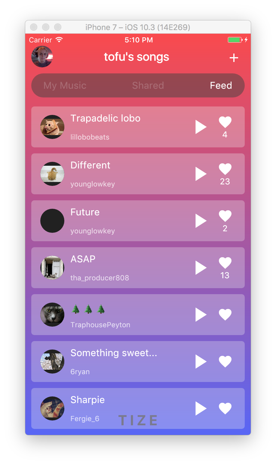
Entonces, en la imagen de arriba, en la parte superior, el texto "Canciones de tofu" está alineado como
centerInParent
dentro de un
RelativeLayout
.
Mientras que los otros 2 son
alignParentLeft
y
alignParentRight
En cada celda, donde está el ícono de fuego, el número de Me gusta en la parte inferior se alinea alrededor del centro del ícono de la llama. Además, el título superior e inferior de cada celda están alineados a la derecha y a la parte superior e inferior del avatar de la imagen, respectivamente.
Los diseños de aleteo generalmente se crean utilizando un árbol de widgets de
Column
,
Row
y
Stack
.
Estos widgets toman argumentos de constructor que especifican reglas sobre cómo se distribuyen los elementos secundarios en relación con el elemento primario, y también puede influir en el diseño de elementos secundarios individuales envolviéndolos en widgets
Expanded
,
Flexible
,
Positioned
,
Align
o centrales.
También es posible construir diseños complejos utilizando
CustomMultiChildLayout
.
Así es como se implementa
Scaffold
internamente, y un ejemplo de cómo usarlo en una aplicación aparece en la
demostración de Shrine
.
También puede usar
LayoutBuilder
o
CustomPaint
, o bajar una capa y extender
RenderObject
como se muestra en el
ejemplo del sector
.
Hacer sus diseños manualmente de esta manera es más trabajo y crea más potencial de errores en los casos de esquina, por lo que trataría de sobrevivir con las primitivas de diseño de alto nivel si es posible.
Para responder a sus preguntas específicas:
-
Use los argumentos
AppBarytrailingdeAppBarpara colocar los elementos de la barra de aplicaciones. Si desea utilizar unaRow, usemainAxisAlignmentdeMainAxisAlignment.spaceBetween. -
Use una
RowconcrossAxisAlignmentdeCrossAxisAlignment.centerpara colocar el icono de fuego y el número debajo. -
Use una
ColumnconmainAxisAlignmentdeMainAxisAlignment.spaceBetweenpara colocar su título superior e inferior. (Debería considerar usarListTilepara diseñar los mosaicos de la lista, pero perderá el control sobre la posición exacta si hace esto).
Aquí hay un fragmento de código que implementa el diseño que proporcionó.
En este ejemplo, utilicé un
IntrinsicHeight
para determinar la altura de los mosaicos de la canción, pero puede mejorar el rendimiento codificándolos a una altura fija.
import ''package:flutter/material.dart'';

void main() {
  runApp(new MyApp());
}

class MyApp extends StatelessWidget {
  @override
  Widget build(BuildContext context) {
    return new MaterialApp(
      title: ''Flutter Demo'',
      theme: new ThemeData(
        brightness: Brightness.dark,
        primaryColorBrightness: Brightness.dark,
      ),
      home: new HomeScreen(),
      debugShowCheckedModeBanner: false,
    );
  }
}

class Song extends StatelessWidget {
  const Song({ this.title, this.author, this.likes });

  final String title;
  final String author;
  final int likes;

  @override
  Widget build(BuildContext context) {
    TextTheme textTheme = Theme
      .of(context)
      .textTheme;
    return new Container(
      margin: const EdgeInsets.symmetric(horizontal: 10.0, vertical: 5.0),
      padding: const EdgeInsets.symmetric(horizontal: 15.0, vertical: 10.0),
      decoration: new BoxDecoration(
        color: Colors.grey.shade200.withOpacity(0.3),
        borderRadius: new BorderRadius.circular(5.0),
      ),
      child: new IntrinsicHeight(
        child: new Row(
          crossAxisAlignment: CrossAxisAlignment.stretch,
          children: <Widget>[
            new Container(
              margin: const EdgeInsets.only(top: 4.0, bottom: 4.0, right: 10.0),
              child: new CircleAvatar(
                backgroundImage: new NetworkImage(
                  ''http://thecatapi.com/api/images/get?format=src''
                    ''&size=small&type=jpg#${title.hashCode}''
                ),
                radius: 20.0,
              ),
            ),
            new Expanded(
              child: new Container(
                child: new Column(
                  crossAxisAlignment: CrossAxisAlignment.start,
                  mainAxisAlignment: MainAxisAlignment.spaceBetween,
                  children: <Widget>[
                    new Text(title, style: textTheme.subhead),
                    new Text(author, style: textTheme.caption),
                  ],
                ),
              ),
            ),
            new Container(
              margin: new EdgeInsets.symmetric(horizontal: 5.0),
              child: new InkWell(
                child: new Icon(Icons.play_arrow, size: 40.0),
                onTap: () {
                  // TODO(implement)
                },
              ),
            ),
            new Container(
              margin: new EdgeInsets.symmetric(horizontal: 5.0),
              child: new InkWell(
                child: new Column(
                  mainAxisAlignment: MainAxisAlignment.center,
                  crossAxisAlignment: CrossAxisAlignment.center,
                  children: <Widget>[
                    new Icon(Icons.favorite, size: 25.0),
                    new Text(''${likes ?? ''''}''),
                  ],
                ),
                onTap: () {
                  // TODO(implement)
                },
              ),
            ),
          ],
        ),
      ),
    );
  }
}

class Feed extends StatelessWidget {
  @override
  Widget build(BuildContext context) {
    return new ListView(
      children: [
        new Song(title: ''Trapadelic lobo'', author: ''lillobobeats'', likes: 4),
        new Song(title: ''Different'', author: ''younglowkey'', likes: 23),
        new Song(title: ''Future'', author: ''younglowkey'', likes: 2),
        new Song(title: ''ASAP'', author: ''tha_producer808'', likes: 13),
        new Song(title: ''🌲🌲🌲'', author: ''TraphousePeyton''),
        new Song(title: ''Something sweet...'', author: ''6ryan''),
        new Song(title: ''Sharpie'', author: ''Fergie_6''),
      ],
    );
  }
}

class CustomTabBar extends AnimatedWidget implements PreferredSizeWidget {
  CustomTabBar({ this.pageController, this.pageNames })
    : super(listenable: pageController);

  final PageController pageController;
  final List<String> pageNames;

  @override
  final Size preferredSize = new Size(0.0, 40.0);

  @override
  Widget build(BuildContext context) {
    TextTheme textTheme = Theme
      .of(context)
      .textTheme;
    return new Container(
      height: 40.0,
      margin: const EdgeInsets.all(10.0),
      padding: const EdgeInsets.symmetric(horizontal: 20.0),
      decoration: new BoxDecoration(
        color: Colors.grey.shade800.withOpacity(0.5),
        borderRadius: new BorderRadius.circular(20.0),
      ),
      child: new Row(
        mainAxisAlignment: MainAxisAlignment.spaceBetween,
        children: new List.generate(pageNames.length, (int index) {
          return new InkWell(
            child: new Text(
              pageNames[index],
              style: textTheme.subhead.copyWith(
                color: Colors.white.withOpacity(
                  index == pageController.page ? 1.0 : 0.2,
                ),
              )
            ),
            onTap: () {
              pageController.animateToPage(
                index,
                curve: Curves.easeOut,
                duration: const Duration(milliseconds: 300),
              );
            }
          );
        })
          .toList(),
      ),
    );
  }
}

class HomeScreen extends StatefulWidget {
  @override
  _HomeScreenState createState() => new _HomeScreenState();
}

class _HomeScreenState extends State<HomeScreen> {

  PageController _pageController = new PageController(initialPage: 2);

  @override
  build(BuildContext context) {
    final Map<String, Widget> pages = <String, Widget>{
      ''My Music'': new Center(
        child: new Text(''My Music not implemented''),
      ),
      ''Shared'': new Center(
        child: new Text(''Shared not implemented''),
      ),
      ''Feed'': new Feed(),
    };
    TextTheme textTheme = Theme
      .of(context)
      .textTheme;
    return new Stack(
      children: [
        new Container(
          decoration: new BoxDecoration(
            gradient: new LinearGradient(
              begin: FractionalOffset.topCenter,
              end: FractionalOffset.bottomCenter,
              colors: [
                const Color.fromARGB(255, 253, 72, 72),
                const Color.fromARGB(255, 87, 97, 249),
              ],
              stops: [0.0, 1.0],
            )
          ),
          child: new Align(
            alignment: FractionalOffset.bottomCenter,
            child: new Container(
              padding: const EdgeInsets.all(10.0),
              child: new Text(
                ''T I Z E'',
                style: textTheme.headline.copyWith(
                  color: Colors.grey.shade800.withOpacity(0.8),
                  fontWeight: FontWeight.bold,
                ),
              ),
            )
          )
        ),
        new Scaffold(
          backgroundColor: const Color(0x00000000),
          appBar: new AppBar(
            backgroundColor: const Color(0x00000000),
            elevation: 0.0,
            leading: new Center(
              child: new ClipOval(
                child: new Image.network(
                  ''http://i.imgur.com/TtNPTe0.jpg'',
                ),
              ),
            ),
            actions: [
              new IconButton(
                icon: new Icon(Icons.add),
                onPressed: () {
                  // TODO: implement
                },
              ),
            ],
            title: const Text(''tofu/'s songs''),
            bottom: new CustomTabBar(
              pageController: _pageController,
              pageNames: pages.keys.toList(),
            ),
          ),
          body: new PageView(
            controller: _pageController,
            children: pages.values.toList(),
          ),
        ),
      ],
    );
  }
}
Nota final: en este ejemplo, utilicé una
AppBar
normal, pero también podría usar una
CustomScrollView
con un
SliverAppBar
que tiene una
elevation
de 0.0.
Eso haría que el contenido sea visible a medida que se desplaza detrás de la barra de aplicaciones.
Es complicado lograr que esto
PageView
bien con
PageView
, ya que se espera que se establezca un área de tamaño fijo.
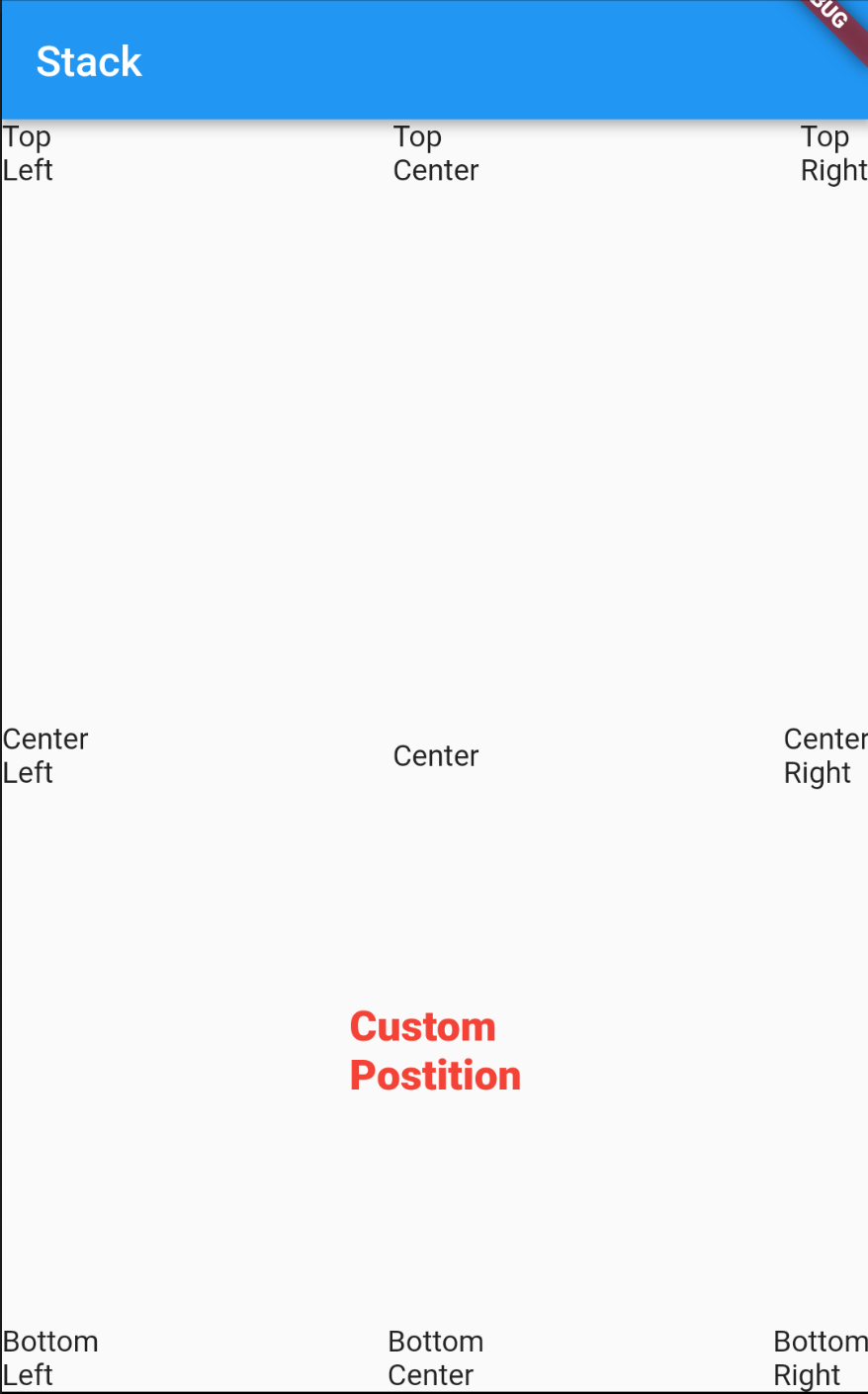
Puede usar
Stack
y puede tener sus hijos como
Positioned
o
Align
.
Ejemplo # 1
(Usando
Positioned
en la
Stack
)
Stack(
  children: <Widget>[
    Positioned(left: 0.0, child: Text("Top/nleft")),
    Positioned(bottom: 0.0, child: Text("Bottom/nleft")),
    Positioned(top: 0.0, right: 0.0, child: Text("Top/nright")),
    Positioned(bottom: 0.0, right: 0.0, child: Text("Bottom/nright")),
    Positioned(bottom: 0.0, right: 0.0, child: Text("Bottom/nright")),
    Positioned(left: width / 2, top: height / 2, child: Text("Center")),
    Positioned(top: height / 2, child: Text("Center/nleft")),
    Positioned(top: height / 2, right: 0.0, child: Text("Center/nright")),
    Positioned(left: width / 2, child: Text("Center/ntop")),
    Positioned(left: width / 2, bottom: 0.0, child: Text("Center/nbottom")),
  ],
)
Ejemplo # 2
(Usando
Align
en la
Stack
)
Stack(
  children: <Widget>[
    Align(alignment: Alignment.center, child: Text("Center"),),
    Align(alignment: Alignment.topRight, child: Text("Top/nRight"),),
    Align(alignment: Alignment.centerRight, child: Text("Center/nRight"),),
    Align(alignment: Alignment.bottomRight, child: Text("Bottom/nRight"),),
    Align(alignment: Alignment.topLeft, child: Text("Top/nLeft"),),
    Align(alignment: Alignment.centerLeft, child: Text("Center/nLeft"),),
    Align(alignment: Alignment.bottomLeft, child: Text("Bottom/nLeft"),),
    Align(alignment: Alignment.topCenter, child: Text("Top/nCenter"),),
    Align(alignment: Alignment.bottomCenter, child: Text("Bottom/nCenter"),),
    Align(alignment: Alignment(0.0, 0.5), child: Text("Custom/nPostition", style: TextStyle(color: Colors.red, fontSize: 20.0, fontWeight: FontWeight.w800),),),
  ],
);
Captura de pantalla: