javascript - para - barra de progreso upload php
¿Cómo crear una barra de progreso circular en QML+JS puro? (6)
Conozco la solución utilizando propiedades de rotation . Ver ejemplo
https://gitorious.org/apps-4-me/staq-me/source/fd20fe5b6fec053f364219842905e2afc5cfdc9d:ui.qml#L172
Mi aplicación se realiza utilizando QML + JS y estoy buscando crear un widget de barra de progreso circular. Puedo crear el círculo utilizando un Rectángulo QML y configurando su radio igual a su ancho / 2 para convertirlo en un círculo. ¿Cómo creo una barra de progreso fuera de ella?
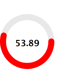
Estoy planeando implementar la siguiente maqueta.
Encontré un ejemplo de Diego Dotta en GitHub usando dos círculos rotativos que parecen funcionar bien para este caso de uso. Se trata de establecer la duración de un PropertyAnimation. Entonces, si bien esto funciona bien para un temporizador que puede configurar, necesitaría un enfoque diferente para algo que no sabía cuánto tiempo tomaría. Esto se ha ajustado un poco y se ha transferido a QtQuick 2.0:
main.qml :
import QtQuick 2.0
import Ubuntu.Components 0.1

Rectangle {
    width: units.gu(50)
    height: units.gu(50)

    property int seconds : 0

    LoadCircle {
        id: circle
        anchors.centerIn: parent
        loadtimer: 10*1000 // 10 seconds
        Component.onCompleted: start();
        onFinishedChanged: {
            timer.stop();
            borderColor = "green"
        }
    }

    Rectangle {
        id : theTimer
        anchors.centerIn: parent
        width : units.gu(10) ; height: units.gu(10)

        Label {
            text: seconds
            font.bold: true
            fontSize: "x-large"
            anchors.centerIn: parent
        }
    }

    Timer {
        id: timer
        interval: 1000; running: true; repeat: true;
        onTriggered: seconds++;
    }

}
LoadCircle.qml :
import QtQuick 2.0
import Ubuntu.Components 0.1

Row{
    id: circle

    property int loadtimer: 4000
    property color circleColor: "transparent"
    property color borderColor: "red"
    property int borderWidth: 10
    property alias running: initCircle.running
    property bool finished: false;

    width: units.gu(30)
    height: width

    function start(){
        part1.rotation = 180
        part2.rotation = 180
        initCircle.start()
    }

    function stop(){
        initCircle.stop()
    }

    Item{
        width: parent.width/2
        height: parent.height
        clip: true

        Item{
            id: part1
            width: parent.width
            height: parent.height
            clip: true
            rotation: 180
            transformOrigin: Item.Right

            Rectangle{
                width: circle.width-(borderWidth*2)
                height: circle.height-(borderWidth*2)
                radius: width/2
                x:borderWidth
                y:borderWidth
                color: circleColor
                border.color: borderColor
                border.width: borderWidth
                smooth: true
            }
        }
    }

    Item{
        width: parent.width/2
        height: parent.height
        clip: true

        Item{
            id: part2
            width: parent.width
            height: parent.height
            clip: true

            rotation: 180
            transformOrigin: Item.Left

            Rectangle{
                width: circle.width-(borderWidth*2)
                height: circle.height-(borderWidth*2)
                radius: width/2
                x: -width/2
                y: borderWidth
                color: circleColor
                border.color: borderColor
                border.width: borderWidth
                smooth: true
            }
        }
    }
    SequentialAnimation{
        id: initCircle
        PropertyAnimation{ target: part2; property: "rotation"; to:360; duration:loadtimer/2 }
        PropertyAnimation{ target: part1; property: "rotation"; to:360; duration:loadtimer/2 }
        ScriptAction { script: finished = true; }
    }
}
Encontré una solución bastante elegante en QML simple que también se puede usar para diseñar un componente QtQuick ProgressBar normal. La idea detrás de esto es utilizar un ConicalGradient en un Rectangle solo borde.
Aquí está el código:
import QtQuick 2.3
import QtQuick.Controls.Styles 1.2
import QtGraphicalEffects 1.0

ProgressBarStyle
{
   panel : Rectangle
   {
      color: "transparent"
      implicitWidth: 80
      implicitHeight: implicitWidth

      Rectangle
      {
         id: outerRing
         z: 0
         anchors.fill: parent
         radius: Math.max(width, height) / 2
         color: "transparent"
         border.color: "gray"
         order.width: 8
      }

      Rectangle
      {
         id: innerRing
         z: 1
         anchors.fill: parent
         anchors.margins: (outerRing.border.width - border.width) / 2
         radius: outerRing.radius
         color: "transparent"
         border.color: "darkgray"
         border.width: 4

         ConicalGradient
         {
            source: innerRing
            anchors.fill: parent
            gradient: Gradient
            {
               GradientStop { position: 0.00; color: "white" }
               GradientStop { position: control.value; color: "white" }
               GradientStop { position: control.value + 0.01; color: "transparent" }
               GradientStop { position: 1.00; color: "transparent" }
            }
         }
      }

      Text
      {
         id: progressLabel
         anchors.centerIn: parent
         color: "black"
         text: (control.value * 100).toFixed() + "%"
      }
   }
}
He implementado un progreso circular básico utilizando un lienzo.
import QtQml 2.2
import QtQuick 2.0

// draws two arcs (portion of a circle)
// fills the circle with a lighter secondary color
// when pressed
Canvas {
    id: canvas
    width: 240
    height: 240
    antialiasing: true

    property color primaryColor: "orange"
    property color secondaryColor: "lightblue"

    property real centerWidth: width / 2
    property real centerHeight: height / 2
    property real radius: Math.min(canvas.width, canvas.height) / 2

    property real minimumValue: 0
    property real maximumValue: 100
    property real currentValue: 33

    // this is the angle that splits the circle in two arcs
    // first arc is drawn from 0 radians to angle radians
    // second arc is angle radians to 2*PI radians
    property real angle: (currentValue - minimumValue) / (maximumValue - minimumValue) * 2 * Math.PI

    // we want both circle to start / end at 12 o''clock
    // without this offset we would start / end at 9 o''clock
    property real angleOffset: -Math.PI / 2

    property string text: "Text"

    signal clicked()

    onPrimaryColorChanged: requestPaint()
    onSecondaryColorChanged: requestPaint()
    onMinimumValueChanged: requestPaint()
    onMaximumValueChanged: requestPaint()
    onCurrentValueChanged: requestPaint()

    onPaint: {
        var ctx = getContext("2d");
        ctx.save();

        ctx.clearRect(0, 0, canvas.width, canvas.height);

        // fills the mouse area when pressed
        // the fill color is a lighter version of the
        // secondary color

        if (mouseArea.pressed) {
            ctx.beginPath();
            ctx.lineWidth = 1;
            ctx.fillStyle = Qt.lighter(canvas.secondaryColor, 1.25);
            ctx.arc(canvas.centerWidth,
                    canvas.centerHeight,
                    canvas.radius,
                    0,
                    2*Math.PI);
            ctx.fill();
        }

        // First, thinner arc
        // From angle to 2*PI

        ctx.beginPath();
        ctx.lineWidth = 1;
        ctx.strokeStyle = primaryColor;
        ctx.arc(canvas.centerWidth,
                canvas.centerHeight,
                canvas.radius,
                angleOffset + canvas.angle,
                angleOffset + 2*Math.PI);
        ctx.stroke();


        // Second, thicker arc
        // From 0 to angle

        ctx.beginPath();
        ctx.lineWidth = 3;
        ctx.strokeStyle = canvas.secondaryColor;
        ctx.arc(canvas.centerWidth,
                canvas.centerHeight,
                canvas.radius,
                canvas.angleOffset,
                canvas.angleOffset + canvas.angle);
        ctx.stroke();

        ctx.restore();
    }

    Text {
        anchors.centerIn: parent

        text: canvas.text
        color: canvas.primaryColor
    }

    MouseArea {
        id: mouseArea

        anchors.fill: parent
        onClicked: canvas.clicked()
        onPressedChanged: canvas.requestPaint()
    }
}
La mejor manera sería utilizar la imagen de archivo PNG. Debido a que se ejecuta más rápido que qml puro, especialmente si usa gradiente. Si solo desea qml puro, no lo encontré de todos modos, excepto si agrega un módulo C ++ personalizado a su proyecto. Ver http://qt-project.org/doc/qt-4.8/qml-extending.html
Solo use el componente de mando EEIoT ( https://github.com/IndeemaSoftware/EEIoT ). Cambie los parámetros fromAngle: 0 y toAngle: Math.PI * 2. Invertir también: true si necesita progreso para revertir
    Knob {
    id: knob
    x: 0
    y: 83
    width: 100
    height: 100
    from:0
    to: 100
    fromAngle: 0
    toAngle: Math.PI*2
    reverse: false
}