img - Cómo transformar el negro en cualquier color usando solo filtros CSS
filter css (6)
Noté que el ejemplo del tratamiento a través de un filtro SVG estaba incompleto, escribí el mío (que funciona perfectamente): (vea la respuesta de Michael Mullany) así que aquí está la forma de obtener el color que desee:
PickColor.onchange=()=>{
    RGBval.textContent = PickColor.value;

    let
    HexT = /^#?([a-f/d]{2})([a-f/d]{2})([a-f/d]{2})$/i.exec(PickColor.value),
    r = parseInt(HexT[1], 16),
    g = parseInt(HexT[2], 16),
    b = parseInt(HexT[3], 16);

    FilterVal.textContent =  SetFilter( r, g, b);
}
function SetFilter( r, g, b )
{
    const Matrix  = document.querySelector(''#FilterSVG feColorMatrix'');
    r = r/255;
    g = g/255;
    b = b/255;

    Matrix.setAttribute("values",  "0 0 0 0 "+r+" 0 0 0 0 "+g+ " 0 0 0 0 "+b+" 0 0 0 1 0");

    return "/n 0 0 0 0 "+r+"/n 0 0 0 0 "+g+ "/n 0 0 0 0 "+b+"/n 0 0 0 1 0"
}
#RGBval    { text-transform: uppercase }
#PickColor { height: 50px; margin: 0 20px }
th         { background-color: lightblue; padding: 5px 20px }
pre        { margin: 0 15px }
#ImgTest   { filter: url(#FilterSVG) }
<svg height="0px" width="0px">
    <defs>
      <filter id="FilterSVG" color-interpolation-filters="sRGB">
        <feColorMatrix type="matrix" values="0 0 0 0 0 0 0 0 0 0 0 0 0 0 0 0 0 0 1 0"/>
      </filter>
    </defs>
  </svg>

  <table>
    <caption>SVG method</caption>
    <tr> <th>Image</th> <th>Color</th> </tr>
    <tr>
      <td><img src="https://www.nouveauelevator.com/image/black-icon/android.png" id="ImgTest" /></td>
      <td><input type="color" value="#000000"  id="PickColor" ></td>
    </tr>
    <tr> <td>.</td> <td>.</td> </tr>
    <tr> <th>Filter value </th> <th>#RBG target</th> </tr>
    <tr>
      <td><pre id="FilterVal">
    0 0 0 0 0
    0 0 0 0 0
    0 0 0 0 0
    0 0 0 1 0</pre></td>
        <td id="RGBval">#000000</td>
    </tr>
  </table>
Aquí hay una segunda solución, usando SVG Filter solo en code => URL.createObjectURL
const
  SVG_Filter = {
    init(ImgID)
    {
      this.Img = document.getElementById(ImgID);
      let
        NS = ''http://www.w3.org/2000/svg'';

      this.SVG    = document.createElementNS(NS,''svg''),
      this.filter = document.createElementNS(NS,''filter''),
      this.matrix = document.createElementNS(NS,''feColorMatrix'');

      this.filter.setAttribute( ''id'', ''FilterSVG'');
      this.filter.setAttribute( ''color-interpolation-filters'', ''sRGB'');

      this.matrix.setAttribute( ''type'', ''matrix'');
      this.matrix.setAttribute(''values'', ''0 0 0 0 0 0 0 0 0 0 0 0 0 0 0 0 0 0 1 0'');

      this.filter.appendChild(this.matrix);
      this.SVG.appendChild(this.filter);

      this.xXMLs = new XMLSerializer();
    },
    SetColor( r, g, b )
    {
      r = r/255;
      g = g/255;
      b = b/255;

      this.matrix.setAttribute(''values'', ''0 0 0 0 ''+r+'' 0 0 0 0 ''+g+ '' 0 0 0 0 ''+b+'' 0 0 0 1 0'');

      let
        xBlob = new Blob( [ this.xXMLs.serializeToString(this.SVG) ], { type: ''image/svg+xml'' });
        xURL  = URL.createObjectURL(xBlob);

      this.Img.style.filter = ''url('' + xURL + ''#FilterSVG)'';

      return ''/n 0 0 0 0 ''+r+''/n 0 0 0 0 ''+g+ ''/n 0 0 0 0 ''+b+''/n 0 0 0 1 0'';
    }
  }

SVG_Filter.init(''ImgTest'');

PickColor.onchange=()=>{
  RGBval.textContent = PickColor.value;

  let
    HexT = /^#?([a-f/d]{2})([a-f/d]{2})([a-f/d]{2})$/i.exec(PickColor.value),
    r = parseInt(HexT[1], 16),
    g = parseInt(HexT[2], 16),
    b = parseInt(HexT[3], 16);

  FilterVal.textContent = SVG_Filter.SetColor( r, g, b );
}
#RGBval    { text-transform: uppercase }
#PickColor { height: 50px; margin: 0 20px }
th         { background-color: lightblue; padding: 5px 20px }
pre        { margin: 0 15px }
#PickColor { width:90px; height:28px; }
<table>
  <caption>SVG method</caption>
  <tr> <th>Image</th> <th>Color</th> </tr>
  <tr>
    <td><img src="https://www.nouveauelevator.com/image/black-icon/android.png" id="ImgTest" /></td>
    <td><input type="color" value="#E2218A" id="PickColor" ></td>
  </tr>
  <tr> <td>.</td> <td>.</td> </tr>
  <tr> <th>Filter value </th> <th>#RBG target</th> </tr>
  <tr>
    <td><pre id="FilterVal">
  0 0 0 0 0
  0 0 0 0 0
  0 0 0 0 0
  0 0 0 1 0</pre></td>
      <td id="RGBval">#000000</td>
  </tr>
</table>
Mi pregunta es: dado un color RGB objetivo, ¿cuál es la fórmula para volver a colorear el negro (
#000
) en ese color usando solo
filtros CSS
?
Para que se acepte una respuesta, necesitaría proporcionar una función (en cualquier idioma) que acepte el color de destino como argumento y devuelva la cadena de
filter
CSS correspondiente.
El contexto para esto es la necesidad de volver a colorear un SVG dentro de una
background-image
.
En este caso, es para admitir ciertas funciones matemáticas de TeX en KaTeX:
https://github.com/Khan/KaTeX/issues/587
.
Ejemplo
Si el color de destino es
#ffff00
(amarillo), una solución correcta es:
filter: invert(100%) sepia() saturate(10000%) hue-rotate(0deg)
( demo )
No metas
- Animación.
- Soluciones sin filtro CSS.
- A partir de un color que no sea negro.
- Preocuparse por lo que sucede con los colores que no sean el negro
Resultados hasta ahora
-
Búsqueda de fuerza bruta para parámetros de una lista de filtro fija: https://stackoverflow.com/a/43959856/181228
Contras: ineficiente, solo genera algunos de los 16.777.216 colores posibles (676.248 conhueRotateStep=1). -
Una solución de búsqueda más rápida con SPSA : https://stackoverflow.com/a/43960991/181228 Bounty Award
-
Una solución https://stackoverflow.com/a/43959853/181228 : https://stackoverflow.com/a/43959853/181228
Contras: no funciona en Edge. Requiere cambios de CSS sinfiltery cambios menores de HTML.
¡Aún puede obtener una respuesta aceptada enviando una solución sin fuerza bruta!
Recursos
-
Cómo se calculan los
hue-rotateysepia: https://stackoverflow.com/a/29521147/181228 Ejemplo de implementación de Ruby:LUM_R = 0.2126; LUM_G = 0.7152; LUM_B = 0.0722 HUE_R = 0.1430; HUE_G = 0.1400; HUE_B = 0.2830 def clamp(num) [0, [255, num].min].max.round end def hue_rotate(r, g, b, angle) angle = (angle % 360 + 360) % 360 cos = Math.cos(angle * Math::PI / 180) sin = Math.sin(angle * Math::PI / 180) [clamp( r * ( LUM_R + (1 - LUM_R) * cos - LUM_R * sin ) + g * ( LUM_G - LUM_G * cos - LUM_G * sin ) + b * ( LUM_B - LUM_B * cos + (1 - LUM_B) * sin )), clamp( r * ( LUM_R - LUM_R * cos + HUE_R * sin ) + g * ( LUM_G + (1 - LUM_G) * cos + HUE_G * sin ) + b * ( LUM_B - LUM_B * cos - HUE_B * sin )), clamp( r * ( LUM_R - LUM_R * cos - (1 - LUM_R) * sin ) + g * ( LUM_G - LUM_G * cos + LUM_G * sin ) + b * ( LUM_B + (1 - LUM_B) * cos + LUM_B * sin ))] end def sepia(r, g, b) [r * 0.393 + g * 0.769 + b * 0.189, r * 0.349 + g * 0.686 + b * 0.168, r * 0.272 + g * 0.534 + b * 0.131] endTenga en cuenta que la
clampanterior hace que la función dehue-rotateno sea lineal. -
Demostración: cómo obtener un color sin escala de grises desde un color en escala de grises: https://stackoverflow.com/a/25524145/181228
-
Una fórmula que casi funciona (de una pregunta similar ):
https://stackoverflow.com/a/29958459/181228Una explicación detallada de por qué la fórmula anterior es incorrecta (CSS
hue-rotateno es una rotación de tono real sino una aproximación lineal):
https://stackoverflow.com/a/19325417/2441511
Puede hacer todo esto muy simple simplemente usando un filtro SVG referenciado desde CSS. Solo necesita una única feColorMatrix para hacer un cambio de color. Éste se vuelve a amarillear. La quinta columna en feColorMatrix contiene los valores objetivo de RGB en la escala de la unidad. (para amarillo - es 1,1,0)
.icon {
  filter: url(#recolorme);
}
<svg height="0px" width="0px">
<defs>
  #ffff00
  <filter id="recolorme" color-interpolation-filters="sRGB">
    <feColorMatrix type="matrix" values="0 0 0 0 1
                                         0 0 0 0 1
                                         0 0 0 0 0
                                         0 0 0 1 0"/>
  </filter>
</defs>
</svg>


<img class="icon" src="https://www.nouveauelevator.com/image/black-icon/android.png">
Solo usa
fill: #000000
La
fill
propiedad en CSS es para rellenar el color de una forma SVG.
La
fill
propiedad puede aceptar cualquier valor de color CSS.
@Dave fue el primero en publicar
una respuesta
a esto (con un código de trabajo), y su respuesta ha sido una fuente inestimable de
copia desvergonzada e
inspiración para mí.
Esta publicación comenzó como un intento de explicar y refinar la respuesta de @ Dave, pero desde entonces se ha convertido en una respuesta propia.
Mi método es significativamente más rápido. Según un punto de referencia jsPerf en colores RGB generados aleatoriamente, el algoritmo de @ Dave se ejecuta en 600 ms , mientras que el mío se ejecuta en 30 ms . Esto definitivamente puede importar, por ejemplo, en el tiempo de carga, donde la velocidad es crítica.
Además, para algunos colores, mi algoritmo funciona mejor:
-
Para
rgb(0,255,0), @ Dave''s producergb(29,218,34)y producergb(1,255,0) -
Para
rgb(0,0,255), @ Dave''s producergb(37,39,255)y el mío producergb(5,6,255) -
Para
rgb(19,11,118), @ Dave''s producergb(36,27,102)y el mío producergb(20,11,112)
Manifestación
"use strict";
class Color {
constructor(r, g, b) { this.set(r, g, b); }
toString() { return `rgb(${Math.round(this.r)}, ${Math.round(this.g)}, ${Math.round(this.b)})`; }
set(r, g, b) {
this.r = this.clamp(r);
this.g = this.clamp(g);
this.b = this.clamp(b);
}
hueRotate(angle = 0) {
angle = angle / 180 * Math.PI;
let sin = Math.sin(angle);
let cos = Math.cos(angle);
this.multiply([
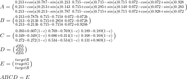
0.213 + cos * 0.787 - sin * 0.213, 0.715 - cos * 0.715 - sin * 0.715, 0.072 - cos * 0.072 + sin * 0.928,
0.213 - cos * 0.213 + sin * 0.143, 0.715 + cos * 0.285 + sin * 0.140, 0.072 - cos * 0.072 - sin * 0.283,
0.213 - cos * 0.213 - sin * 0.787, 0.715 - cos * 0.715 + sin * 0.715, 0.072 + cos * 0.928 + sin * 0.072
]);
}
grayscale(value = 1) {
this.multiply([
0.2126 + 0.7874 * (1 - value), 0.7152 - 0.7152 * (1 - value), 0.0722 - 0.0722 * (1 - value),
0.2126 - 0.2126 * (1 - value), 0.7152 + 0.2848 * (1 - value), 0.0722 - 0.0722 * (1 - value),
0.2126 - 0.2126 * (1 - value), 0.7152 - 0.7152 * (1 - value), 0.0722 + 0.9278 * (1 - value)
]);
}
sepia(value = 1) {
this.multiply([
0.393 + 0.607 * (1 - value), 0.769 - 0.769 * (1 - value), 0.189 - 0.189 * (1 - value),
0.349 - 0.349 * (1 - value), 0.686 + 0.314 * (1 - value), 0.168 - 0.168 * (1 - value),
0.272 - 0.272 * (1 - value), 0.534 - 0.534 * (1 - value), 0.131 + 0.869 * (1 - value)
]);
}
saturate(value = 1) {
this.multiply([
0.213 + 0.787 * value, 0.715 - 0.715 * value, 0.072 - 0.072 * value,
0.213 - 0.213 * value, 0.715 + 0.285 * value, 0.072 - 0.072 * value,
0.213 - 0.213 * value, 0.715 - 0.715 * value, 0.072 + 0.928 * value
]);
}
multiply(matrix) {
let newR = this.clamp(this.r * matrix[0] + this.g * matrix[1] + this.b * matrix[2]);
let newG = this.clamp(this.r * matrix[3] + this.g * matrix[4] + this.b * matrix[5]);
let newB = this.clamp(this.r * matrix[6] + this.g * matrix[7] + this.b * matrix[8]);
this.r = newR; this.g = newG; this.b = newB;
}
brightness(value = 1) { this.linear(value); }
contrast(value = 1) { this.linear(value, -(0.5 * value) + 0.5); }
linear(slope = 1, intercept = 0) {
this.r = this.clamp(this.r * slope + intercept * 255);
this.g = this.clamp(this.g * slope + intercept * 255);
this.b = this.clamp(this.b * slope + intercept * 255);
}
invert(value = 1) {
this.r = this.clamp((value + (this.r / 255) * (1 - 2 * value)) * 255);
this.g = this.clamp((value + (this.g / 255) * (1 - 2 * value)) * 255);
this.b = this.clamp((value + (this.b / 255) * (1 - 2 * value)) * 255);
}
hsl() { // Code taken from https://.com/a/9493060/2688027, licensed under CC BY-SA.
let r = this.r / 255;
let g = this.g / 255;
let b = this.b / 255;
let max = Math.max(r, g, b);
let min = Math.min(r, g, b);
let h, s, l = (max + min) / 2;
if(max === min) {
h = s = 0;
} else {
let d = max - min;
s = l > 0.5 ? d / (2 - max - min) : d / (max + min);
switch(max) {
case r: h = (g - b) / d + (g < b ? 6 : 0); break;
case g: h = (b - r) / d + 2; break;
case b: h = (r - g) / d + 4; break;
} h /= 6;
}
return {
h: h * 100,
s: s * 100,
l: l * 100
};
}
clamp(value) {
if(value > 255) { value = 255; }
else if(value < 0) { value = 0; }
return value;
}
}
class Solver {
constructor(target) {
this.target = target;
this.targetHSL = target.hsl();
this.reusedColor = new Color(0, 0, 0); // Object pool
}
solve() {
let result = this.solveNarrow(this.solveWide());
return {
values: result.values,
loss: result.loss,
filter: this.css(result.values)
};
}
solveWide() {
const A = 5;
const c = 15;
const a = [60, 180, 18000, 600, 1.2, 1.2];
let best = { loss: Infinity };
for(let i = 0; best.loss > 25 && i < 3; i++) {
let initial = [50, 20, 3750, 50, 100, 100];
let result = this.spsa(A, a, c, initial, 1000);
if(result.loss < best.loss) { best = result; }
} return best;
}
solveNarrow(wide) {
const A = wide.loss;
const c = 2;
const A1 = A + 1;
const a = [0.25 * A1, 0.25 * A1, A1, 0.25 * A1, 0.2 * A1, 0.2 * A1];
return this.spsa(A, a, c, wide.values, 500);
}
spsa(A, a, c, values, iters) {
const alpha = 1;
const gamma = 0.16666666666666666;
let best = null;
let bestLoss = Infinity;
let deltas = new Array(6);
let highArgs = new Array(6);
let lowArgs = new Array(6);
for(let k = 0; k < iters; k++) {
let ck = c / Math.pow(k + 1, gamma);
for(let i = 0; i < 6; i++) {
deltas[i] = Math.random() > 0.5 ? 1 : -1;
highArgs[i] = values[i] + ck * deltas[i];
lowArgs[i] = values[i] - ck * deltas[i];
}
let lossDiff = this.loss(highArgs) - this.loss(lowArgs);
for(let i = 0; i < 6; i++) {
let g = lossDiff / (2 * ck) * deltas[i];
let ak = a[i] / Math.pow(A + k + 1, alpha);
values[i] = fix(values[i] - ak * g, i);
}
let loss = this.loss(values);
if(loss < bestLoss) { best = values.slice(0); bestLoss = loss; }
} return { values: best, loss: bestLoss };
function fix(value, idx) {
let max = 100;
if(idx === 2 /* saturate */) { max = 7500; }
else if(idx === 4 /* brightness */ || idx === 5 /* contrast */) { max = 200; }
if(idx === 3 /* hue-rotate */) {
if(value > max) { value = value % max; }
else if(value < 0) { value = max + value % max; }
} else if(value < 0) { value = 0; }
else if(value > max) { value = max; }
return value;
}
}
loss(filters) { // Argument is array of percentages.
let color = this.reusedColor;
color.set(0, 0, 0);
color.invert(filters[0] / 100);
color.sepia(filters[1] / 100);
color.saturate(filters[2] / 100);
color.hueRotate(filters[3] * 3.6);
color.brightness(filters[4] / 100);
color.contrast(filters[5] / 100);
let colorHSL = color.hsl();
return Math.abs(color.r - this.target.r)
+ Math.abs(color.g - this.target.g)
+ Math.abs(color.b - this.target.b)
+ Math.abs(colorHSL.h - this.targetHSL.h)
+ Math.abs(colorHSL.s - this.targetHSL.s)
+ Math.abs(colorHSL.l - this.targetHSL.l);
}
css(filters) {
function fmt(idx, multiplier = 1) { return Math.round(filters[idx] * multiplier); }
return `filter: invert(${fmt(0)}%) sepia(${fmt(1)}%) saturate(${fmt(2)}%) hue-rotate(${fmt(3, 3.6)}deg) brightness(${fmt(4)}%) contrast(${fmt(5)}%);`;
}
}
$("button.execute").click(() => {
let rgb = $("input.target").val().split(",");
if (rgb.length !== 3) { alert("Invalid format!"); return; }
let color = new Color(rgb[0], rgb[1], rgb[2]);
let solver = new Solver(color);
let result = solver.solve();
let lossMsg;
if (result.loss < 1) {
lossMsg = "This is a perfect result.";
} else if (result.loss < 5) {
lossMsg = "The is close enough.";
} else if(result.loss < 15) {
lossMsg = "The color is somewhat off. Consider running it again.";
} else {
lossMsg = "The color is extremely off. Run it again!";
}
$(".realPixel").css("background-color", color.toString());
$(".filterPixel").attr("style", result.filter);
$(".filterDetail").text(result.filter);
$(".lossDetail").html(`Loss: ${result.loss.toFixed(1)}. <b>${lossMsg}</b>`);
});
.pixel {
    display: inline-block;
    background-color: #000;
    width: 50px;
    height: 50px;
}

.filterDetail {
    font-family: "Consolas", "Menlo", "Ubuntu Mono", monospace;
}
<script src="https://ajax.googleapis.com/ajax/libs/jquery/2.1.1/jquery.min.js"></script>

<input class="target" type="text" placeholder="r, g, b" value="250, 150, 50" />
<button class="execute">Compute Filters</button>

<p>Real pixel, color applied through CSS <code>background-color</code>:</p>
<div class="pixel realPixel"></div>

<p>Filtered pixel, color applied through CSS <code>filter</code>:</p>
<div class="pixel filterPixel"></div>

<p class="filterDetail"></p>
<p class="lossDetail"></p>
Uso
let color = new Color(0, 255, 0);
let solver = new Solver(color);
let result = solver.solve();
let filterCSS = result.css;
Explicación
Comenzaremos escribiendo algunos Javascript.
"use strict";

class Color {
    constructor(r, g, b) {
        this.r = this.clamp(r);
        this.g = this.clamp(g);
        this.b = this.clamp(b);
    } toString() { return `rgb(${Math.round(this.r)}, ${Math.round(this.g)}, ${Math.round(this.b)})`; }

    hsl() { // Code taken from https://.com/a/9493060/2688027, licensed under CC BY-SA.
        let r = this.r / 255;
        let g = this.g / 255;
        let b = this.b / 255;
        let max = Math.max(r, g, b);
        let min = Math.min(r, g, b);
        let h, s, l = (max + min) / 2;

        if(max === min) {
            h = s = 0;
        } else {
            let d = max - min;
            s = l > 0.5 ? d / (2 - max - min) : d / (max + min);
            switch(max) {
                case r: h = (g - b) / d + (g < b ? 6 : 0); break;
                case g: h = (b - r) / d + 2; break;
                case b: h = (r - g) / d + 4; break;
            } h /= 6;
        }

        return {
            h: h * 100,
            s: s * 100,
            l: l * 100
        };
    }

    clamp(value) {
        if(value > 255) { value = 255; }
        else if(value < 0) { value = 0; }
        return value;
    }
}

class Solver {
    constructor(target) {
        this.target = target;
        this.targetHSL = target.hsl();
    }

    css(filters) {
        function fmt(idx, multiplier = 1) { return Math.round(filters[idx] * multiplier); }
        return `filter: invert(${fmt(0)}%) sepia(${fmt(1)}%) saturate(${fmt(2)}%) hue-rotate(${fmt(3, 3.6)}deg) brightness(${fmt(4)}%) contrast(${fmt(5)}%);`;
    }
}
Explicación:
-
La clase
Colorrepresenta un color RGB.-
Su función
toString()devuelve el color en una cadena de color CSSrgb(...). -
Su función
hsl()devuelve el color, convertido a HSL . -
Su función
clamp()asegura que un valor de color dado esté dentro de los límites (0-255).
-
Su función
-
La clase
Solverintentará resolver un color objetivo.-
Su función
css()devuelve un filtro dado en una cadena de filtro CSS.
-
Su función
Implementando
grayscale()
,
sepia()
y
saturate()
El corazón de los filtros CSS / SVG son las primitivas de filtro , que representan modificaciones de bajo nivel a una imagen.
Los filtros en
grayscale()
,
sepia()
y
saturate()
son implementados por la primitiva de filtro
<feColorMatrix>
, que realiza
la multiplicación de matrices
entre una matriz especificada por el filtro (a menudo generada dinámicamente) y una matriz creada a partir del color.
Diagrama:
Hay algunas optimizaciones que podemos hacer aquí:
-
El último elemento de la matriz de color es y siempre será
1. No tiene sentido calcularlo o almacenarlo. -
Tampoco tiene sentido calcular o almacenar el valor alfa / transparencia (
A), ya que estamos tratando con RGB, no con RGBA. - Por lo tanto, podemos recortar las matrices de filtro de 5x5 a 3x5, y la matriz de color de 1x5 a 1x3 . Esto ahorra un poco de trabajo.
-
Todos los filtros
<feColorMatrix>dejan las columnas 4 y 5 como ceros. Por lo tanto, podemos reducir aún más la matriz del filtro a 3x3 . - Dado que la multiplicación es relativamente simple, no es necesario arrastrar en bibliotecas matemáticas complejas para esto. Podemos implementar el algoritmo de multiplicación de matrices nosotros mismos.
Implementación:
function multiply(matrix) {
    let newR = this.clamp(this.r * matrix[0] + this.g * matrix[1] + this.b * matrix[2]);
    let newG = this.clamp(this.r * matrix[3] + this.g * matrix[4] + this.b * matrix[5]);
    let newB = this.clamp(this.r * matrix[6] + this.g * matrix[7] + this.b * matrix[8]);
    this.r = newR; this.g = newG; this.b = newB;
}
(Utilizamos variables temporales para mantener los resultados de cada multiplicación de fila, porque no queremos cambios en
this.r
, etc. que afecten los cálculos posteriores).
Ahora que hemos implementado
<feColorMatrix>
, podemos implementar
grayscale()
,
sepia()
y
saturate()
, que simplemente lo invocan con una matriz de filtro dada:
function grayscale(value = 1) {
    this.multiply([
        0.2126 + 0.7874 * (1 - value), 0.7152 - 0.7152 * (1 - value), 0.0722 - 0.0722 * (1 - value),
        0.2126 - 0.2126 * (1 - value), 0.7152 + 0.2848 * (1 - value), 0.0722 - 0.0722 * (1 - value),
        0.2126 - 0.2126 * (1 - value), 0.7152 - 0.7152 * (1 - value), 0.0722 + 0.9278 * (1 - value)
    ]);
}

function sepia(value = 1) {
    this.multiply([
        0.393 + 0.607 * (1 - value), 0.769 - 0.769 * (1 - value), 0.189 - 0.189 * (1 - value),
        0.349 - 0.349 * (1 - value), 0.686 + 0.314 * (1 - value), 0.168 - 0.168 * (1 - value),
        0.272 - 0.272 * (1 - value), 0.534 - 0.534 * (1 - value), 0.131 + 0.869 * (1 - value)
    ]);
}

function saturate(value = 1) {
    this.multiply([
        0.213 + 0.787 * value, 0.715 - 0.715 * value, 0.072 - 0.072 * value,
        0.213 - 0.213 * value, 0.715 + 0.285 * value, 0.072 - 0.072 * value,
        0.213 - 0.213 * value, 0.715 - 0.715 * value, 0.072 + 0.928 * value
    ]);
}
Implementando
hue-rotate()
El filtro
hue-rotate()
es implementado por
<feColorMatrix>
.
La matriz de filtro se calcula como se muestra a continuación:
Por ejemplo, el elemento a 00 se calcularía así:
Algunas notas:
-
El ángulo de rotación se da en grados.
Debe convertirse a radianes antes de pasar a
Math.sin()oMath.cos(). -
Math.sin(angle)yMath.cos(angle)deben calcularse una vez y luego almacenarse en caché.
Implementación:
function hueRotate(angle = 0) {
    angle = angle / 180 * Math.PI;
    let sin = Math.sin(angle);
    let cos = Math.cos(angle);

    this.multiply([
        0.213 + cos * 0.787 - sin * 0.213, 0.715 - cos * 0.715 - sin * 0.715, 0.072 - cos * 0.072 + sin * 0.928,
        0.213 - cos * 0.213 + sin * 0.143, 0.715 + cos * 0.285 + sin * 0.140, 0.072 - cos * 0.072 - sin * 0.283,
        0.213 - cos * 0.213 - sin * 0.787, 0.715 - cos * 0.715 + sin * 0.715, 0.072 + cos * 0.928 + sin * 0.072
    ]);
}
Implementación de
brightness()
y
contrast()
Los filtros de
brightness()
y
contrast()
son implementados por
<feComponentTransfer>
con
<feFuncX type="linear" />
.
Cada elemento
<feFuncX type="linear" />
acepta un atributo de
pendiente
e
intercepción
.
Luego calcula cada nuevo valor de color a través de una fórmula simple:
value = slope * value + intercept
Esto es fácil de implementar:
function linear(slope = 1, intercept = 0) {
    this.r = this.clamp(this.r * slope + intercept * 255);
    this.g = this.clamp(this.g * slope + intercept * 255);
    this.b = this.clamp(this.b * slope + intercept * 255);
}
Una vez que esto se implementa, el
brightness()
y el
contrast()
se pueden implementar:
function brightness(value = 1) { this.linear(value); }
function contrast(value = 1) { this.linear(value, -(0.5 * value) + 0.5); }
Implementando
invert()
El filtro
invert()
es implementado por
<feComponentTransfer>
con
<feFuncX type="table" />
.
La especificación dice:
A continuación, C es el componente inicial y C '' es el componente reasignado; ambos en el intervalo cerrado [0,1].
Para "tabla", la función se define por interpolación lineal entre los valores dados en el atributo tableValues . La tabla tiene valores n + 1 (es decir, v 0 a v n ) que especifican los valores inicial y final para n regiones de interpolación de tamaño uniforme. Las interpolaciones usan la siguiente fórmula:
Para un valor C, encuentre k tal que:
k / n ≤ C <(k + 1) / n
El resultado C '' viene dado por:
C ''= v k + (C - k / n) * n * (v k + 1 - v k )
Una explicación de esta fórmula:
-
El filtro
invert()define esta tabla: [valor, 1 - valor]. Esto es tableValues o v . - La fórmula define n , de modo que n + 1 es la longitud de la tabla. Como la longitud de la tabla es 2, n = 1.
- La fórmula define k , con k y k + 1 como índices de la tabla. Como la tabla tiene 2 elementos, k = 0.
Por lo tanto, podemos simplificar la fórmula para:
C ''= v 0 + C * (v 1 - v 0 )
Al alinear los valores de la tabla, nos quedamos con:
C ''= valor + C * (1 - valor - valor)
Una simplificación más:
C ''= valor + C * (1 - 2 * valor)
La especificación define C y C '' como valores RGB, dentro de los límites 0-1 (en oposición a 0-255). Como resultado, debemos reducir los valores antes del cálculo, y volver a aumentarlos después.
Así llegamos a nuestra implementación:
function invert(value = 1) {
    this.r = this.clamp((value + (this.r / 255) * (1 - 2 * value)) * 255);
    this.g = this.clamp((value + (this.g / 255) * (1 - 2 * value)) * 255);
    this.b = this.clamp((value + (this.b / 255) * (1 - 2 * value)) * 255);
}
Interludio: algoritmo de fuerza bruta de @ Dave
El código de @ Dave genera 176,660 combinaciones de filtros, que incluyen:
-
11 filtros
invert()(0%, 10%, 20%, ..., 100%) -
11 filtros
sepia()(0%, 10%, 20%, ..., 100%) -
20 filtros
saturate()(5%, 10%, 15%, ..., 100%) -
73 filtros de
hue-rotate()(0deg, 5deg, 10deg, ..., 360deg)
Calcula los filtros en el siguiente orden:
filter: invert(a%) sepia(b%) saturate(c%) hue-rotate(θdeg);
Luego itera a través de todos los colores calculados. Se detiene una vez que ha encontrado un color generado dentro de la tolerancia (todos los valores RGB están dentro de las 5 unidades del color objetivo).
Sin embargo, esto es lento e ineficiente. Por lo tanto, presento mi propia respuesta.
Implementando SPSA
Primero, debemos definir una función de pérdida , que devuelve la diferencia entre el color producido por una combinación de filtros y el color de destino. Si los filtros son perfectos, la función de pérdida debería devolver 0.
Mediremos la diferencia de color como la suma de dos métricas:
- Diferencia RGB, porque el objetivo es producir el valor RGB más cercano.
-
Diferencia HSL, porque muchos valores HSL corresponden a filtros (p. Ej., El tono se correlaciona aproximadamente con el
hue-rotate(), la saturación se correlaciona consaturate(), etc.) Esto guía el algoritmo.
La función de pérdida tomará un argumento: una matriz de porcentajes de filtro.
Utilizaremos el siguiente orden de filtro:
filter: invert(a%) sepia(b%) saturate(c%) hue-rotate(θdeg) brightness(e%) contrast(f%);
Implementación:
function loss(filters) {
    let color = new Color(0, 0, 0);
    color.invert(filters[0] / 100);
    color.sepia(filters[1] / 100);
    color.saturate(filters[2] / 100);
    color.hueRotate(filters[3] * 3.6);
    color.brightness(filters[4] / 100);
    color.contrast(filters[5] / 100);

    let colorHSL = color.hsl();
    return Math.abs(color.r - this.target.r)
        + Math.abs(color.g - this.target.g)
        + Math.abs(color.b - this.target.b)
        + Math.abs(colorHSL.h - this.targetHSL.h)
        + Math.abs(colorHSL.s - this.targetHSL.s)
        + Math.abs(colorHSL.l - this.targetHSL.l);
}
Intentaremos minimizar la función de pérdida, de modo que:
loss([a, b, c, d, e, f]) = 0
El algoritmo SPSA ( website , más información , paper , documento de implementación , código de referencia ) es muy bueno en esto. Fue diseñado para optimizar sistemas complejos con mínimos locales, funciones de pérdida ruidosas / no lineales / multivariadas, etc. Se ha utilizado para ajustar motores de ajedrez . Y a diferencia de muchos otros algoritmos, los documentos que lo describen son realmente comprensibles (aunque con gran esfuerzo).
Implementación:
function spsa(A, a, c, values, iters) {
    const alpha = 1;
    const gamma = 0.16666666666666666;

    let best = null;
    let bestLoss = Infinity;
    let deltas = new Array(6);
    let highArgs = new Array(6);
    let lowArgs = new Array(6);

    for(let k = 0; k < iters; k++) {
        let ck = c / Math.pow(k + 1, gamma);
        for(let i = 0; i < 6; i++) {
            deltas[i] = Math.random() > 0.5 ? 1 : -1;
            highArgs[i] = values[i] + ck * deltas[i];
            lowArgs[i]  = values[i] - ck * deltas[i];
        }

        let lossDiff = this.loss(highArgs) - this.loss(lowArgs);
        for(let i = 0; i < 6; i++) {
            let g = lossDiff / (2 * ck) * deltas[i];
            let ak = a[i] / Math.pow(A + k + 1, alpha);
            values[i] = fix(values[i] - ak * g, i);
        }

        let loss = this.loss(values);
        if(loss < bestLoss) { best = values.slice(0); bestLoss = loss; }
    } return { values: best, loss: bestLoss };

    function fix(value, idx) {
        let max = 100;
        if(idx === 2 /* saturate */) { max = 7500; }
        else if(idx === 4 /* brightness */ || idx === 5 /* contrast */) { max = 200; }

        if(idx === 3 /* hue-rotate */) {
            if(value > max) { value = value % max; }
            else if(value < 0) { value = max + value % max; }
        } else if(value < 0) { value = 0; }
        else if(value > max) { value = max; }
        return value;
    }
}
Hice algunas modificaciones / optimizaciones a SPSA:
- Usando el mejor resultado producido, en lugar del último.
-
Reutilizando todas las matrices (
deltas,highArgs,lowArgs), en lugar delowArgscon cada iteración. - Usando una matriz de valores para a , en lugar de un solo valor. Esto se debe a que todos los filtros son diferentes y, por lo tanto, deberían moverse / converger a diferentes velocidades.
-
Ejecutar una función de
fixdespués de cada iteración. Sujeta todos los valores entre 0% y 100%, exceptosaturate(donde el máximo es 7500%),brightnessycontrast(donde el máximo es 200%) yhueRotate(donde los valores se envuelven en lugar de limitarse).
Yo uso SPSA en un proceso de dos etapas:
- La etapa "amplia", que trata de "explorar" el espacio de búsqueda. Hará reintentos limitados de SPSA si los resultados no son satisfactorios.
- La etapa "estrecha", que toma el mejor resultado de la etapa amplia e intenta "refinarla". Utiliza valores dinámicos para A y a .
Implementación:
function solve() {
    let result = this.solveNarrow(this.solveWide());
    return {
        values: result.values,
        loss: result.loss,
        filter: this.css(result.values)
    };
}

function solveWide() {
    const A = 5;
    const c = 15;
    const a = [60, 180, 18000, 600, 1.2, 1.2];

    let best = { loss: Infinity };
    for(let i = 0; best.loss > 25 && i < 3; i++) {
        let initial = [50, 20, 3750, 50, 100, 100];
        let result = this.spsa(A, a, c, initial, 1000);
        if(result.loss < best.loss) { best = result; }
    } return best;
}

function solveNarrow(wide) {
    const A = wide.loss;
    const c = 2;
    const A1 = A + 1;
    const a = [0.25 * A1, 0.25 * A1, A1, 0.25 * A1, 0.2 * A1, 0.2 * A1];
    return this.spsa(A, a, c, wide.values, 500);
}
Tuning SPSA
Advertencia: no se meta con el código SPSA, especialmente con sus constantes, a menos que esté seguro de saber lo que está haciendo.
Las constantes importantes son
A
,
a
,
c
, los valores iniciales, los umbrales de reintento, los valores de
max
en
fix()
y el número de iteraciones de cada etapa.
Todos estos valores se ajustaron cuidadosamente para producir buenos resultados, y atornillarlos al azar casi definitivamente reducirá la utilidad del algoritmo.
Si insiste en alterarlo, debe medir antes de "optimizar".
Primero, aplique este parche .
Luego ejecute el código en Node.js. Después de bastante tiempo, el resultado debería ser algo como esto:
Average loss: 3.4768521401985275
Average time: 11.4915ms
Ahora sintonice las constantes al contenido de su corazón.
Algunos consejos:
- La pérdida promedio debe ser de alrededor de 4. Si es mayor que 4, está produciendo resultados que están demasiado lejos, y debe ajustar la precisión. Si es inferior a 4, está perdiendo el tiempo y debe reducir el número de iteraciones.
- Si aumenta / disminuye el número de iteraciones, ajuste A apropiadamente.
- Si aumenta / disminuye A , ajuste adecuadamente.
-
Use el indicador
--debugsi desea ver el resultado de cada iteración.
TL; DR
Este fue un viaje por la madriguera del conejo, pero aquí está
var tolerance = 1;
var invertRange = [0, 1];
var invertStep = 0.1;
var sepiaRange = [0, 1];
var sepiaStep = 0.1;
var saturateRange = [5, 100];
var saturateStep = 5;
var hueRotateRange = [0, 360];
var hueRotateStep = 5;
var possibleColors;
var color = document.getElementById(''color'');
var pixel = document.getElementById(''pixel'');
var filtersBox = document.getElementById(''filters'');
var button = document.getElementById(''button'');
button.addEventListener(''click'', function() {
 getNewColor(color.value);
})

// matrices taken from https://www.w3.org/TR/filter-effects/#feColorMatrixElement
function sepiaMatrix(s) {
 return [
  (0.393 + 0.607 * (1 - s)), (0.769 - 0.769 * (1 - s)), (0.189 - 0.189 * (1 - s)),
  (0.349 - 0.349 * (1 - s)), (0.686 + 0.314 * (1 - s)), (0.168 - 0.168 * (1 - s)),
  (0.272 - 0.272 * (1 - s)), (0.534 - 0.534 * (1 - s)), (0.131 + 0.869 * (1 - s)),
 ]
}

function saturateMatrix(s) {
 return [
  0.213+0.787*s, 0.715-0.715*s, 0.072-0.072*s,
  0.213-0.213*s, 0.715+0.285*s, 0.072-0.072*s,
  0.213-0.213*s, 0.715-0.715*s, 0.072+0.928*s,
 ]
}

function hueRotateMatrix(d) {
 var cos = Math.cos(d * Math.PI / 180);
 var sin = Math.sin(d * Math.PI / 180);
 var a00 = 0.213 + cos*0.787 - sin*0.213;
 var a01 = 0.715 - cos*0.715 - sin*0.715;
 var a02 = 0.072 - cos*0.072 + sin*0.928;

 var a10 = 0.213 - cos*0.213 + sin*0.143;
 var a11 = 0.715 + cos*0.285 + sin*0.140;
 var a12 = 0.072 - cos*0.072 - sin*0.283;

 var a20 = 0.213 - cos*0.213 - sin*0.787;
 var a21 = 0.715 - cos*0.715 + sin*0.715;
 var a22 = 0.072 + cos*0.928 + sin*0.072;

 return [
  a00, a01, a02,
  a10, a11, a12,
  a20, a21, a22,
 ]
}

function clamp(value) {
 return value > 255 ? 255 : value < 0 ? 0 : value;
}

function filter(m, c) {
 return [
  clamp(m[0]*c[0] + m[1]*c[1] + m[2]*c[2]),
  clamp(m[3]*c[0] + m[4]*c[1] + m[5]*c[2]),
  clamp(m[6]*c[0] + m[7]*c[1] + m[8]*c[2]),
 ]
}

function invertBlack(i) {
 return [
  i * 255,
  i * 255,
  i * 255,
 ]
}

function generateColors() {
 let possibleColors = [];

 let invert = invertRange[0];
 for (invert; invert <= invertRange[1]; invert+=invertStep) {
  let sepia = sepiaRange[0];
  for (sepia; sepia <= sepiaRange[1]; sepia+=sepiaStep) {
   let saturate = saturateRange[0];
   for (saturate; saturate <= saturateRange[1]; saturate+=saturateStep) {
    let hueRotate = hueRotateRange[0];
    for (hueRotate; hueRotate <= hueRotateRange[1]; hueRotate+=hueRotateStep) {
     let invertColor = invertBlack(invert);
     let sepiaColor = filter(sepiaMatrix(sepia), invertColor);
     let saturateColor = filter(saturateMatrix(saturate), sepiaColor);
     let hueRotateColor = filter(hueRotateMatrix(hueRotate), saturateColor);

     let colorObject = {
      filters: { invert, sepia, saturate, hueRotate },
      color: hueRotateColor
     }

     possibleColors.push(colorObject);
    }
   }
  }
 }

 return possibleColors;
}

function getFilters(targetColor, localTolerance) {
 possibleColors = possibleColors || generateColors();

 for (var i = 0; i < possibleColors.length; i++) {
  var color = possibleColors[i].color;
  if (
   Math.abs(color[0] - targetColor[0]) < localTolerance &&
   Math.abs(color[1] - targetColor[1]) < localTolerance &&
   Math.abs(color[2] - targetColor[2]) < localTolerance
  ) {
   return filters = possibleColors[i].filters;
   break;
  }
 }

 localTolerance += tolerance;
 return getFilters(targetColor, localTolerance)
}

function getNewColor(color) {
 var targetColor = color.split('','');
 targetColor = [
     parseInt(targetColor[0]), // [R]
     parseInt(targetColor[1]), // [G]
     parseInt(targetColor[2]), // [B]
    ]
    var filters = getFilters(targetColor, tolerance);
    var filtersCSS = ''filter: '' +
     ''invert(''+Math.floor(filters.invert*100)+''%) ''+
     ''sepia(''+Math.floor(filters.sepia*100)+''%) '' +
     ''saturate(''+Math.floor(filters.saturate*100)+''%) '' +
     ''hue-rotate(''+Math.floor(filters.hueRotate)+''deg);'';
    pixel.style = filtersCSS;
    filtersBox.innerText = filtersCSS
}

getNewColor(color.value);
#pixel {
  width: 50px;
  height: 50px;
  background: rgb(0,0,0);
}
<input type="text" id="color" placeholder="R,G,B" value="250,150,50" />
<button id="button">get filters</button>
<div id="pixel"></div>
<div id="filters"></div>
EDITAR: Esta solución no está destinada para uso en producción y solo ilustra un enfoque que se puede tomar para lograr lo que OP está pidiendo. Como es, es débil en algunas áreas del espectro de color. Se pueden lograr mejores resultados con más granularidad en las iteraciones de pasos o implementando más funciones de filtro por las razones descritas en detalle en la respuesta de @ MultiplyByZer0 .
EDIT2: OP está buscando una solución de fuerza no bruta. En ese caso es bastante simple, solo resuelve esta ecuación:
dónde
a = hue-rotation
b = saturation
c = sepia
d = invert
Nota: OP me pidió recuperar , pero la recompensa irá a la respuesta de Dave.
Sé que no es lo que se preguntó en el cuerpo de la pregunta, y ciertamente no es lo que estábamos esperando, pero hay un filtro CSS que hace exactamente esto:
drop-shadow()
Advertencias:
- La sombra se dibuja detrás del contenido existente. Esto significa que tenemos que hacer algunos trucos de posicionamiento absoluto.
- Todos los píxeles serán tratados de la misma manera, pero OP dijo [no deberíamos ser] "Preocuparse por lo que sucede con los colores que no sean el negro".
- Soporte de navegador. (No estoy seguro de eso, probado solo con las últimas FF y Chrome).
/* the container used to hide the original bg */

.icon {
  width: 60px;
  height: 60px;
  overflow: hidden;
}


/* the content */

.icon.green>span {
  -webkit-filter: drop-shadow(60px 0px green);
  filter: drop-shadow(60px 0px green);
}

.icon.red>span {
  -webkit-filter: drop-shadow(60px 0px red);
  filter: drop-shadow(60px 0px red);
}

.icon>span {
  -webkit-filter: drop-shadow(60px 0px black);
  filter: drop-shadow(60px 0px black);
  background-position: -100% 0;
  margin-left: -60px;
  display: block;
  width: 61px; /* +1px for chrome bug...*/
  height: 60px;
  background-image: url(data:image/svg+xml;base64,PHN2ZyBmaWxsPSIjMDAwMDAwIiB4bWxucz0iaHR0cDovL3d3dy53My5vcmcvMjAwMC9zdmciIHhtbG5zOnhsaW5rPSJodHRwOi8vd3d3LnczLm9yZy8xOTk5L3hsaW5rIiB2ZXJzaW9uPSIxLjEiIHg9IjBweCIgeT0iMHB4IiB2aWV3Qm94PSIwIDAgOTAgOTAiIGVuYWJsZS1iYWNrZ3JvdW5kPSJuZXcgMCAwIDkwIDkwIiB4bWw6c3BhY2U9InByZXNlcnZlIj48Zz48cGF0aCBmaWxsLXJ1bGU9ImV2ZW5vZGQiIGNsaXAtcnVsZT0iZXZlbm9kZCIgZD0iTTYxLjUxMSwyNi4xNWMtMC43MTQtMS43MzgtMS43MjMtMy4yOTgtMy4wMjYtNC42NzkgICBjLTEuMzAzLTEuMzY2LTIuODA5LTIuNDUyLTQuNTE1LTMuMjU5Yy0xLjc1NC0wLjgyMi0zLjYwMS0xLjI4OC01LjU0LTEuMzk2Yy0wLjI4LTAuMDMxLTAuNTUyLTAuMDQ3LTAuODE0LTAuMDQ3ICAgYy0wLjAxOCwwLTAuMDMxLDAtMC4wNDcsMGMtMC4zMjcsMC4wMTYtMC41NzQsMC4wMjMtMC43NDUsMC4wMjNjLTEuOTcxLDAuMTA4LTMuODQxLDAuNTc0LTUuNjA5LDEuMzk3ICAgYy0xLjcwOCwwLjgwNy0zLjIxMiwxLjg5My00LjUxNywzLjI1OWMtMS4zMTgsMS4zODEtMi4zMjcsMi45NDgtMy4wMjYsNC43MDJ2LTAuMDIzYy0wLjc0NCwxLjgxNS0xLjExOCwzLjcxNi0xLjExOCw1LjcwMiAgIGMtMC4wMTUsMi4wNjQsMC41MzcsNC4xODIsMS42NTQsNi4zNTVjMC41NzQsMS4xMzMsMS4yOTUsMi4yNSwyLjE2NCwzLjM1MmMwLjQ4MiwwLjYwNSwxLjAwMiwxLjIxLDEuNTYsMS44MTYgICBjMC4wMzEsMC4wMTYsMC4wNTUsMC4wMzksMC4wNzEsMC4wN2MwLjUyNywwLjQ5NiwwLjg5MiwwLjk3OCwxLjA5MywxLjQ0M2MwLjEwOCwwLjIzMywwLjE3OSwwLjUyLDAuMjEsMC44NjIgICBjMC4wNDYsMC4zNzEsMC4wNjksMC44MjIsMC4wNjksMS4zNXYxLjA0OGMwLDAuNjIsMC4xMTcsMS4yMTgsMC4zNDksMS43OTJjMC4yMzQsMC41NDMsMC41NiwxLjAyNCwwLjk3OCwxLjQ0M2gwLjAyNSAgIGMwLjQxOCwwLjQxOSwwLjg5MiwwLjc0NSwxLjQyLDAuOTc3aDAuMDIzYzAuNTU4LDAuMjQ5LDEuMTQ4LDAuMzczLDEuNzY5LDAuMzczaDcuMjg3YzAuNjIsMCwxLjIwOS0wLjEyNCwxLjc2OS0wLjM3MyAgIGMwLjU0My0wLjIzMSwxLjAyMy0wLjU1OCwxLjQ0My0wLjk3N2MwLjQxOC0wLjQxOSwwLjc0My0wLjksMC45NzgtMS40NDNjMC4yNDgtMC41NzQsMC4zNzEtMS4xNzIsMC4zNzEtMS43OTJ2LTEuMDQ4ICAgYzAtMC41MjcsMC4wMjMtMC45NzksMC4wNzEtMS4zNWMwLjAyOS0wLjM0MiwwLjA5Mi0wLjYzNywwLjE4Ni0wLjg4NWMwLjEwOC0wLjIzMywwLjI2NC0wLjQ3MywwLjQ2Ni0wLjcyMnYtMC4wMjMgICBjMC4xODctMC4yMzMsMC40MDMtMC40NjYsMC42NTEtMC42OTljMC4wMTYtMC4wMTYsMC4wMzEtMC4wMywwLjA0Ny0wLjA0NmMwLjU3NC0wLjYwNSwxLjEwMy0xLjIxLDEuNTgzLTEuODE2ICAgYzAuODY4LTEuMTAyLDEuNTkxLTIuMjE5LDIuMTY1LTMuMzUyYzEuMTE3LTIuMTczLDEuNjY3LTQuMjkxLDEuNjUyLTYuMzU1QzYyLjYwNSwyOS44NTksNjIuMjQsMjcuOTY2LDYxLjUxMSwyNi4xNXogICAgTTgxLjc4NSw0My4xNDJjMCw2Ljg3NS0xLjc1MywxMy4wMi01LjI2MSwxOC40MzZjLTEuMzgxLDIuMTQxLTMuMDMyLDQuMTY3LTQuOTU4LDYuMDc1Yy02Ljc1LDYuNzk3LTE0LjkxMywxMC4xOTUtMjQuNDg2LDEwLjE5NSAgIGMtNi40NTcsMC0xMi4yOTItMS41NDQtMTcuNTA1LTQuNjMyYy0wLjI0OSwwLjI5NS0wLjU2LDAuNTI3LTAuOTMyLDAuNjk4bC0xNi4xMzEsNy42NThjLTAuNTEyLDAuMjMzLTEuMDQ3LDAuMzAzLTEuNjA2LDAuMjEgICBjLTAuNTU5LTAuMDk0LTEuMDQtMC4zNDItMS40NDMtMC43NDVjLTAuNDA0LTAuNDAzLTAuNjUyLTAuODg2LTAuNzQ2LTEuNDQzYy0wLjA5My0wLjU2LTAuMDIzLTEuMDk0LDAuMjEtMS42MDVsNy42NTgtMTYuMjcxICAgYzAuMTQtMC4zMTEsMC4zMzQtMC41NzQsMC41ODMtMC43OTJjLTMuMTk3LTUuMjYxLTQuNzk2LTExLjE4OC00Ljc5Ni0xNy43ODRjMC05LjYyMSwzLjM3Ni0xNy44MDcsMTAuMTI1LTI0LjU1OCAgIGMwLjUyOC0wLjUyNywxLjA3MS0xLjA0LDEuNjMtMS41MzZjMi4yMDQtMS45NTYsNC41MzktMy41Nyw3LjAwNi00Ljg0MkMzNS45NDUsOS42OTIsNDEuMjYsOC40MzYsNDcuMDgsOC40MzYgICBjOS41NzMsMCwxNy43MzYsMy4zODIsMjQuNDg2LDEwLjE0OGM2LjQyNiw2LjM3OCw5LjgyNCwxNC4wMjksMTAuMTk1LDIyLjk1MkM4MS43NzgsNDIuMDYzLDgxLjc4NSw0Mi41OTksODEuNzg1LDQzLjE0MnogICAgTTUxLjM4NiwyNS4yNjZjLTAuNzE0LTAuMzI2LTEuNDU5LTAuNTEzLTIuMjM1LTAuNTU5Yy0wLjQ4LTAuMDMxLTAuODc2LTAuMjI1LTEuMTg4LTAuNTgzYy0wLjMxMS0wLjM0LTAuNDU3LTAuNzUyLTAuNDQxLTEuMjMzICAgYzAuMDMxLTAuNDY2LDAuMjI1LTAuODU0LDAuNTgyLTEuMTY1YzAuMzU3LTAuMzEsMC43NjktMC40NTcsMS4yMzQtMC40NDFjMS4yMjYsMC4wNzcsMi4zOTcsMC4zOCwzLjUxNSwwLjkwNyAgIGMxLjA2OSwwLjQ5NywyLjAxOCwxLjE3OSwyLjg0LDIuMDQ5YzAuODA3LDAuODY5LDEuNDM1LDEuODU0LDEuODg0LDIuOTU2YzAuNDY2LDEuMTMzLDAuNjk5LDIuMzIsMC42OTksMy41NjIgICBjMCwwLjQ2NS0wLjE3MSwwLjg2OS0wLjUxMiwxLjIxYy0wLjMyNSwwLjMyNi0wLjcyMiwwLjQ4OS0xLjE4OCwwLjQ4OWMtMC40OCwwLTAuODg0LTAuMTYzLTEuMjEtMC40ODkgICBjLTAuMzQyLTAuMzQxLTAuNTEzLTAuNzQ2LTAuNTEzLTEuMjFjMC0wLjc5Mi0wLjE0Ni0xLjU1Mi0wLjQ0MS0yLjI4MWMtMC4yNzktMC42OTktMC42ODMtMS4zMjctMS4yMTEtMS44ODYgICBTNTIuMDY3LDI1LjU5MSw1MS4zODYsMjUuMjY2eiBNNTcuNzg3LDM1LjM2OGMwLDAuNTEyLTAuMTg4LDAuOTU0LTAuNTYsMS4zMjZjLTAuMzU2LDAuMzU3LTAuOCwwLjUzNi0xLjMyNiwwLjUzNiAgIGMtMC41MTIsMC0wLjk0Ni0wLjE3OS0xLjMwMy0wLjUzNmMtMC4zNzQtMC4zNzItMC41Ni0wLjgxNC0wLjU2LTEuMzI2YzAtMC41MTMsMC4xODYtMC45NTYsMC41Ni0xLjMyNyAgIGMwLjM1Ni0wLjM1NywwLjc5MS0wLjUzNiwxLjMwMy0wLjUzNmMwLjUyNiwwLDAuOTcsMC4xNzgsMS4zMjYsMC41MzZDNTcuNiwzNC40MTMsNTcuNzg3LDM0Ljg1NSw1Ny43ODcsMzUuMzY4eiBNNTEuODk3LDU0LjcxMSAgIEg0My40Yy0wLjcxMiwwLTEuMzE4LDAuMjU2LTEuODE1LDAuNzY5Yy0wLjUxMiwwLjQ5Ny0wLjc2OSwxLjA5NC0wLjc2OSwxLjc5MmMwLDAuNzE0LDAuMjQ5LDEuMzE5LDAuNzQ2LDEuODE1bDAuMDIzLDAuMDI0ICAgYzAuNDk3LDAuNDk2LDEuMTAzLDAuNzQ0LDEuODE1LDAuNzQ0aDguNDk3YzAuNzE1LDAsMS4zMTgtMC4yNDgsMS44MTUtMC43NDRjMC40OTctMC41MTMsMC43NDUtMS4xMjYsMC43NDUtMS44NCAgIGMwLTAuNjk4LTAuMjQ4LTEuMjk1LTAuNzQ1LTEuNzkydi0wLjAyM0M1My4yMDEsNTQuOTU5LDUyLjU5Niw1NC43MTEsNTEuODk3LDU0LjcxMXogTTQyLjcyNiw2Mi40MzhoLTAuMDIzICAgYy0wLjQ5NywwLjQ5Ny0wLjc0NSwxLjEwMy0wLjc0NSwxLjgxNnMwLjI1NywxLjMxOCwwLjc2OSwxLjgxNWMwLjQ5NywwLjQ5NywxLjEwMiwwLjc0NSwxLjgxNiwwLjc0NWg2LjEyMiAgIGMwLjY5NywwLDEuMjk1LTAuMjQ4LDEuNzkyLTAuNzQ1aDAuMDIyYzAuNDk3LTAuNDk3LDAuNzQ2LTEuMTAyLDAuNzQ2LTEuODE1cy0wLjI0OS0xLjMxOS0wLjc0Ni0xLjgxNiAgIGMtMC41MTItMC41MTItMS4xMTctMC43NjgtMS44MTQtMC43NjhoLTYuMTIyQzQzLjgyOCw2MS42NzEsNDMuMjIzLDYxLjkyNyw0Mi43MjYsNjIuNDM4eiIvPjwvZz48L3N2Zz4=);
}
<div class="icon">
  <span></span>
</div>
<div class="icon green">
  <span></span>
</div>
<div class="icon red">
  <span></span>
</div>