lineas - ¿Es posible dibujar un contorno de círculo parcial en CSS(forma de anillo abierto)?
triangulo css border (4)
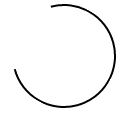
Imagen estática
Un ejemplo simplificado que solo se basa en un único elemento HTML y clase de CSS podría tener este aspecto:
.arc {
  /* Border size and color */
  border: 2px solid #000;
  /* Creates a circle */
  border-radius: 50%;
  /* Circle size */
  height: 100px;
  width: 100px;
  /* Use transparent borders to define opening (more transparent = larger opening) */
  border-top-color: transparent;
  border-left-color: transparent;
  /* Use transform to rotate to adjust where opening appears */
  transform: rotate(300deg)
}
Ejemplo
.arc {
  border: 2px solid #000;
  border-radius: 50%;
  height: 100px;
  width: 100px;
  border-top-color: transparent;
  transform: rotate(300deg)
}
<div class=''arc''></div>
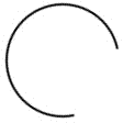
Imagen giratoria
Puede aplicar una rotación básica al ejemplo estático anterior aprovechando las animaciones basadas en CSS utilizando @keyframes :
.arc {
  /* Border size and color */
  border: 2px solid #000;
  /* Creates a circle */
  border-radius: 50%;
  /* Circle size */
  height: 100px;
  width: 100px;
  /* Use transparent borders to define opening (more transparent = larger opening) */
  border-top-color: transparent;
  /* Rotate indefinitely (longer time = slower rotation) */
  animation: rotate 2s infinite linear;
}

@keyframes rotate {
  0%    { transform: rotate(0deg);  }
  100%  { transform: rotate(360deg);  }
}
Ejemplo
.arc {
  border: 2px solid #000;
  border-radius: 50%;
  height: 100px;
  width: 100px;
  border-top-color: transparent;
  animation: rotate 2s infinite linear;
}

@keyframes rotate {
  0%    { transform: rotate(0deg);  }
  100%  { transform: rotate(360deg);  }
}
<div class=''arc''></div>
Dibujo (sin SVG)
Otro enfoque con el que me topé , aunque no es tan elegante como los enfoques anteriores, parece lograr el efecto deseado. Implica el uso de varias animaciones, así como mostrar / ocultar diferentes secciones del círculo según sea necesario.
El fragmento de código contiene un ejemplo que lo demuestra.
Ejemplo
#container {
  position: absolute;
  width: 100px;
  height: 100px;
  animation: colors 1s infinite;
}
#halfclip {
  width: 50%;
  height: 100%;
  right: 0px;
  position: absolute;
  overflow: hidden;
  transform-origin: left center;
  animation: cliprotate 4s steps(2) infinite;
  -webkit-animation: cliprotate 4s steps(2) infinite;
}
.halfcircle {
  box-sizing: border-box;
  height: 100%;
  right: 0px;
  position: absolute;
  border: solid 2px transparent;
  border-top-color: #000;
  border-left-color: #000;
  border-radius: 50%;
}
#clipped {
  width: 200%;
  animation: rotate 2s linear infinite;
  -webkit-animation: rotate 2s linear infinite;
}
#fixed {
  width: 100%;
  transform: rotate(135deg);
  animation: showfixed 4s steps(2) infinite;
  -webkit-animation: showfixed 4s linear infinite;
}
@-webkit-keyframes cliprotate {
  0% {
    transform: rotate(0deg);
  }
  100% {
    transform: rotate(360deg);
  }
}
@keyframes cliprotate {
  0% {
    transform: rotate(0deg);
  }
  100% {
    transform: rotate(360deg);
  }
}
@-webkit-keyframes rotate {
  0% {
    transform: rotate(-45deg);
  }
  100% {
    transform: rotate(135deg);
  }
}
@keyframes rotate {
  0% {
    transform: rotate(-45deg);
  }
  100% {
    transform: rotate(135deg);
  }
}
@-webkit-keyframes showfixed {
  0% {
    opacity: 0;
  }
  49.9% {
    opacity: 0;
  }
  50% {
    opacity: 1;
  }
  100% {
    opacity: 1;
  }
}
<div id="container">
  <div id="halfclip">
    <div class="halfcircle" id="clipped">
    </div>
  </div>
  <div class="halfcircle" id="fixed">
  </div>
</div>
Dibujo (con SVG)
Tomar ventaja de SVG es probablemente la mejor manera de abordar este problema, ya que está diseñado explícitamente para manejar el dibujo dentro del navegador. Recomiendo este enfoque si el soporte SVG está disponible.
La respuesta de Dylan detalla cómo podría ser esta implementación.
Para crear un círculo que dibuje gradualmente su camino externo, use SVG.
La propiedad stroke-dasharray convertirá cualquier ruta en una línea discontinua, que puede utilizar para su ventaja al configurar el tamaño del tablero para que sea casi tan largo como la ruta en sí.
Luego usa una animación CSS para cambiar gradualmente el stroke-dashoffset para mover el tablero alrededor del perímetro de tu círculo.
circle {
  fill: white;
  stroke: black;
  stroke-width: 2;
  stroke-dasharray: 250;
  stroke-dashoffset: 1000;
  animation: rotate 5s linear infinite;
}

@keyframes rotate {
  to {
    stroke-dashoffset: 0;
  }
}
<svg height="100" width="100">
  <circle cx="50" cy="50" r="40" />
</svg>
Puede simplemente tomar un pseudo elemento ::after para crear la parte abierta, con solo superponer el elemento del círculo. La ventaja es que la parte abierta puede ser tan larga como se desee (no se limita a un círculo completo de 3/4).
.circle {
  width: 100px;
  height: 100px;
  border: 2px solid;
  border-radius: 50%;
  margin: 30px;
  animation: rotate 1s infinite linear;
}
.circle::after {
  content: "";
  display: block;
  width: 80px;
  height: 80px;
  background: white;
  border-radius: 50%;
  margin: -30% 0 0 -30%;
}
@keyframes rotate {
  0%    { transform: rotate(0deg);  }
  100%  { transform: rotate(360deg);  }
}
<div class="circle"></div>
para la pseudo versión, también puede usar linear-gradient (la sombra se puede reducir o aumentar) y background-clip ,
donde está disponible, el modo mix-blend-mode puede hacerla translúcida,
currentcolor y la animation también se pueden usar para animar el color:
.loader {
  font-size: 1.5em;
  color: gray;
  position: relative;
  padding: 3px;
  /* make a square */
  height: 100px;
  width: 100px;
  /* center content*/
  display: flex;
  align-items: center;
  justify-content: center;
  animation: coloranim infinite 5s;
}

.circle {
  border-radius: 100%;
  overflow: hidden;
}

.loader:after {
  border-radius: inherit;
  color: inherit;
  content: '''';
  position: absolute;
  top: 0;
  bottom: 0;
  left: 0;
  right: 0;
  padding: 3px;
  background: linear-gradient(white, white), linear-gradient(0deg, transparent 40%, currentcolor 60%), linear-gradient(50deg, transparent 50%, currentcolor 52%);
  background-clip: content-box, border-box, border-box;
  z-index: -1;
  mix-blend-mode: multiply;/* if avalaible, else bg remains white */
}

.spin:after {
  animation: spin 2s linear infinite;
}

@keyframes spin {
  to {
    transform: rotate(360deg);
  }
}

@keyframes coloranim {
  20% {
    color: tomato;
  }
  40% {
    color: purple;
  }
  60% {
    color: turquoise;
  }
  80% {
    color: green;
  }
}


/* demo purpose, use your own style wherever your loader is needed */

html {
  height: 100%;
  display: flex;
  background: url(http://lorempixel.com/800/800/food/3);
  background-size: cover;
  box-shadow: inset 0 0 0 2000px rgba(255, 255, 255, 0.3)
}

body {
  margin: auto;
}
<div class="spin circle loader coloranim"> loading... </div>