img - ¿Cómo creo una lágrima en HTML?
title html (12)
Enfoque SVG:
Puede lograr la doble curva fácilmente con un
SVG en línea
y el elemento
<path/>
lugar del elemento
<polygon/>
que no permite formas curvas.
El siguiente ejemplo utiliza el elemento
<path/>
con:
-
2
comandos de curva bezier cuadrática
para las 2 curvas superiores (líneas que comienzan con
Q) -
1
comando de arco
para el fondo grande (línea que comienza con
A)
<svg width="30%" viewbox="0 0 30 42">
  <path fill="transparent" stroke="#000" stroke-width="1.5"
        d="M15 3
           Q16.5 6.8 25 18
           A12.8 12.8 0 1 1 5 18
           Q13.5 6.8 15 3z" />
</svg>
SVG es una gran herramienta para hacer este tipo de formas con curvas dobles. Puede consultar esta publicación sobre curvas dobles con una comparación SVG / CSS. Algunas de las ventajas de usar SVG en este caso son:
- Control de curvas
- Control de relleno (opacidad, color)
- Control de trazo (ancho, opacidad, color)
- Cantidad de código
- Hora de construir y mantener la forma
- Escalable
- Sin solicitud HTTP (si se usa en línea como en el ejemplo)
El soporte del navegador para SVG en línea vuelve a Internet Explorer 9. Consulte canIuse para obtener más información.
¿Cómo creo una forma como esta para mostrar en una página web?
No quiero usar imágenes, ya que se volverían borrosas al escalar
Intenté con CSS :
.tear {
  display: inline-block;
  transform: rotate(-30deg);
  border: 5px solid green;
  width: 50px;
  height: 100px;
  border-top-left-radius: 50%;
  border-bottom-left-radius: 50%;
  border-bottom-right-radius: 50%;
}
<div class="tear">
</div>
Eso resultó realmente jodido.
Y luego probé con SVG:
<svg viewBox="0 100 100">
  <polygon points="50,0 100,70 50,100 0,70"/>
</svg>
Obtuvo la forma, pero la parte inferior no era curva.
¿Hay alguna forma de crear esta forma para que pueda usarse en una página HTML?
Lienzo HTML
Esta es una opción descubierta en este hilo hasta ahora. Los comandos utilizados para los dibujos de Canvas son muy similares a SVG (y web-tiki merece los créditos por la idea base utilizada en esta respuesta).
La forma en cuestión se puede crear utilizando los comandos de curva propios del lienzo (Cuadrático o Bézier) o la API de ruta. La respuesta contiene ejemplos para los tres métodos.
El soporte del navegador para Canvas es bastante bueno .
Usando curvas cuadráticas
window.onload = function() {
  var canvas = document.getElementById(''canvas'');
  if (canvas.getContext) {
    var ctx = canvas.getContext(''2d'');

    ctx.beginPath();
    ctx.lineJoin = ''miter'';
    ctx.moveTo(120, 20);
    ctx.quadraticCurveTo(117.5, 30, 148, 68);
    ctx.arc(120, 88, 34.5, 5.75, 3.66, false);
    ctx.quadraticCurveTo(117.5, 35, 120, 20);
    ctx.closePath();
    ctx.strokeStyle = ''#000'';
    ctx.lineWidth = 2;
    ctx.fillStyle = ''#77CCEE''
    ctx.stroke();
    ctx.fill();
  }
}
canvas {
  margin: 50px;
  height: 100px;
  width: 200px;
  transform: scale(1.5);
}

body{
  background-image: radial-gradient(circle, #3F9CBA 0%, #153346 100%);
}
<canvas id=''canvas''></canvas>
A continuación se muestra una
versión avanzada
con relleno degradado y sombras.
También he incluido un efecto de
hover
en la forma para ilustrar un inconveniente de Canvas en comparación con SVG.
El lienzo está basado en ráster (píxel) y, por lo tanto, se vería borroso / pixelado cuando se escala más allá de cierto punto.
La única solución para eso sería volver a pintar la forma en cada cambio de tamaño del navegador, que es una sobrecarga.
window.onload = function() {
  var canvas = document.getElementById(''canvas'');
  if (canvas.getContext) {
    var ctx = canvas.getContext(''2d'');
    var lineargradient = ctx.createRadialGradient(135, 95, 1, 135, 95, 10);
    lineargradient.addColorStop(0, ''white'');
    lineargradient.addColorStop(1, ''#77CCEE'');
    ctx.beginPath();
    ctx.lineJoin = ''miter'';
    ctx.moveTo(120, 20);
    ctx.quadraticCurveTo(117.5, 30, 148, 68);
    ctx.arc(120, 88, 34.5, 5.75, 3.66, false);
    ctx.quadraticCurveTo(117.5, 35, 120, 20);
    ctx.closePath();
    ctx.strokeStyle = ''#333'';
    ctx.lineWidth = 3;
    ctx.fillStyle = lineargradient;
    ctx.shadowOffsetX = 2;
    ctx.shadowOffsetY = 2;
    ctx.shadowBlur = 2;
    ctx.shadowColor = "rgba(50, 50, 50, 0.5)";
    ctx.stroke();
    ctx.fill();
  }
}
canvas {
  margin: 50px;
  height: 100px;
  width: 200px;
  transform: scale(1.5);
}


/* Just for demo */

body{
  background-image: radial-gradient(circle, #3F9CBA 0%, #153346 100%);
}

canvas{
  transition: all 1s;
}

canvas:hover{
  transform: scale(2);
}
<canvas id=''canvas''></canvas>
Usar curvas de Bezier
window.onload = function() {
  var canvas = document.getElementById(''canvas'');
  if (canvas.getContext) {
    var ctx = canvas.getContext(''2d'');
    var lineargradient = ctx.createRadialGradient(135, 95, 1, 135, 95, 10);
    lineargradient.addColorStop(0, ''white'');
    lineargradient.addColorStop(1, ''#77CCEE'');
    ctx.beginPath();
    ctx.lineJoin = ''miter'';
    ctx.arc(120, 88, 35, 5.74, 3.66, false);
    ctx.bezierCurveTo(100, 55, 122, 27.5, 120, 20);
    ctx.bezierCurveTo(122, 27.5, 121, 31.5, 150, 70);
    ctx.closePath();
    ctx.strokeStyle = ''rgba(109,195,250,0.2)'';
    ctx.lineWidth = 1;
    ctx.fillStyle = lineargradient;
    ctx.shadowOffsetX = 2;
    ctx.shadowOffsetY = 2;
    ctx.shadowBlur = 2;
    ctx.shadowColor = "rgba(50, 50, 50, 0.5)";
    ctx.stroke();
    ctx.fill();
  }
}
canvas {
  margin: 75px;
  height: 300px;
  width: 300px;
  transform: scale(1.5);
}
body {
  background-image: radial-gradient(circle, #3F9CBA 0%, #153346 100%);
}
<canvas id=''canvas'' height=''300'' width=''300''></canvas>
Usando la API de ruta
window.onload = function() {
  var canvas = document.getElementById(''canvas'');
  if (canvas.getContext) {
    var ctx = canvas.getContext(''2d'');

    ctx.lineJoin = ''miter'';
    var p = new Path2D("M120 20 Q117.5 30 146 68 A34 34 0 1 1 92 68 Q117.5 35 120 20z");
    ctx.strokeStyle = ''#000'';
    ctx.lineWidth = 2;
    ctx.fillStyle = ''#77CCEE''
    ctx.stroke(p);
    ctx.fill(p);
  }
}
canvas {
  margin: 50px;
  height: 100px;
  width: 200px;
  transform: scale(1.5);
}

body {
  background-image: radial-gradient(circle, #3F9CBA 0%, #153346 100%);
}
<canvas id=''canvas''></canvas>
Nota: Como se menciona en mi respuesta here , IE y Safari aún no admiten la API de ruta.
Otras lecturas:
Radio de borde básico
Puede hacer esto dentro de CSS con relativa facilidad usando border-radius ''y transforma. Tu CSS estaba solo un poco fuera.
.tear {
  width: 50px;
  height: 50px;
  border-radius: 0 50% 50% 50%;
  border: 3px solid black;
  transform: rotate(45deg);
  margin-top: 20px;
}
<div class="tear"></div>
Radio de borde avanzado
Esto será muy similar al anterior pero le da un poco más de forma.
.tear {
  width: 50px;
  height: 50px;
  border-radius: 80% 0 55% 50% / 55% 0 80% 50%;
  border: 3px solid black;
  transform: rotate(-45deg);
  margin-top: 20px;
}
<div class="tear"></div>
Versión CSS
Como hay algunas pocas respuestas aquí, pensé por qué no agregarle otro método. Esto está utilizando HTML y CSS para crear la lágrima.
Esto le permitirá cambiar el color del borde y el fondo de la lágrima y también cambiar el tamaño de la parte superior.
Usando un solo
div
podemos crear un círculo con
border
y
border-radius
.
Luego, usando pseudo elementos (
:before
&
:after
) creamos un
triángulo CSS
más aquí
, esto actuará como la punta de la lágrima.
Usando
:before
como borde colocamos
:after
en la parte superior con un tamaño más pequeño y el color de fondo deseado.
div {
  width: 100px;
  height: 100px;
  border-radius: 50%;
  border: 4px solid;
  margin: 80px auto;
  position: relative;
}
div:before,
div:after {
  content: "";
  display: block;
  position: absolute;
  width: 0;
  height: 0;
}
div:before {
  border-left: 50px solid transparent;
  border-right: 50px solid transparent;
  border-bottom: 104px solid black;
  top: -75px;
}
div:after {
  border-left: 46px solid transparent;
  border-right: 46px solid transparent;
  border-bottom: 96px solid #fff;
  top: -66px;
  left: 0;
  right: 0;
  margin: auto;
  z-index: 1;
}
<div></div>
Aquí hay una demostración de la lágrima con un color de fondo.
div {
  width: 100px;
  height: 100px;
  border-radius: 50%;
  border: 4px solid;
  background: red;
  margin: 80px;
  position: relative;
}
div:before,
div:after {
  content: "";
  display: block;
  position: absolute;
  width: 0;
  height: 0;
}
div:before {
  border-left: 50px solid transparent;
  border-right: 50px solid transparent;
  border-bottom: 100px solid black;
  top: -70px;
}
div:after {
  border-left: 46px solid transparent;
  border-right: 46px solid transparent;
  border-bottom: 96px solid red;
  top: -66px;
  left: 0;
  right: 0;
  margin: auto;
  z-index: 1;
}
<div></div>
Es tan simple como poner un color de fondo en el
div
y cambiar
:after
bottom-border
color del
bottom-border
al mismo.
Para cambiar el borde, deberá cambiar el color del borde
div
y
:before
color de fondo también.
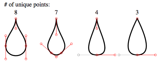
Aquí hay cuatro formas de lágrima SVG progresivamente más simples:
<svg viewbox="-20 -20 180 180">
  <g stroke="black" fill="none">

    <path transform="translate(0)"
     d="M   0  0
        C   0 10  10 17  10 27
        C  10 40 -10 40 -10 27
        C -10 17   0 10   0  0
        Z"/>

    <path transform="translate(40)"
     d="M   0  0
        C   0 16  15 25   5 34
        Q   0 38         -5 34
        C -15 25   0 16   0  0
        Z"/>

    <path transform="translate(80)"
     d="M   0  0
        C   0 10  18 36   0 36
        S          0 10   0  0
        Z"/>

    <path transform="translate(120)"
     d="M   0  0
        Q  18 36   0 36
        T          0  0
        Z"/>


    <g stroke-width="0.25" stroke="red">
      <g transform="translate(0)">
        <ellipse rx="1" ry="1" cx="0"   cy="0" />
        <ellipse rx="1" ry="1" cx="0"   cy="10"/>
        <ellipse rx="1" ry="1" cx="10"  cy="17"/>
        <ellipse rx="1" ry="1" cx="10"  cy="27"/>
        <ellipse rx="1" ry="1" cx="10"  cy="40"/>
        <ellipse rx="1" ry="1" cx="-10" cy="40"/>
        <ellipse rx="1" ry="1" cx="-10" cy="27"/>
        <ellipse rx="1" ry="1" cx="-10" cy="17"/>
        <line x1="0"   y1="0"  x2="0"   y2="10"/>
        <line x1="10"  y1="17" x2="10"  y2="40"/>
        <line x1="-10" y1="40" x2="-10" y2="17"/>
      </g>
      <g transform="translate(40)">
        <ellipse rx="1" ry="1" cx="0"   cy="0" />
        <ellipse rx="1" ry="1" cx="0"   cy="16"/>
        <ellipse rx="1" ry="1" cx="15"  cy="25"/>
        <ellipse rx="1" ry="1" cx="5"   cy="34"/>
        <ellipse rx="1" ry="1" cx="0"   cy="38"/>
        <ellipse rx="1" ry="1" cx="-5"  cy="34"/>
        <ellipse rx="1" ry="1" cx="-15" cy="25"/>
        <line x1="0"  y1="0"  x2="0"   y2="16"/>
        <line x1="15" y1="25" x2="0"   y2="38"/>
        <line x1="0"  y1="38" x2="-15" y2="25"/>
      </g>
      <g transform="translate(80)">
        <ellipse rx="1" ry="1" cx="0"   cy="0" />
        <ellipse rx="1" ry="1" cx="0"   cy="10"/>
        <ellipse rx="1" ry="1" cx="18"  cy="36"/>
        <ellipse rx="1" ry="1" cx="0"   cy="36"/>
        <ellipse rx="1" ry="1" cx="-18" cy="36" stroke="gray"/>
        <line x1="0"  y1="0"  x2="0"   y2="10"/>
        <line x1="18" y1="36" x2="0"   y2="36"/>
        <line x1="0"  y1="36" x2="-18" y2="36" stroke="gray" stroke-dasharray="0.5"/>
      </g>
      <g transform="translate(120)">
        <ellipse rx="1" ry="1" cx="0"   cy="0" />
        <ellipse rx="1" ry="1" cx="18"  cy="36"/>
        <ellipse rx="1" ry="1" cx="0"   cy="36"/>
        <ellipse rx="1" ry="1" cx="-18" cy="36" stroke="gray"/>
        <line x1="18" y1="36" x2="0"   y2="36"/>
        <line x1="0"  y1="36" x2="-18" y2="36" stroke="gray" stroke-dasharray="0.5"/>
      </g>
    </g>
  </g>
  <g font-size="6" transform="translate(-1.5,-4)">
    <text x="-10" y="-8"># of unique points:</text>
    <text transform="translate(  0)">8</text>
    <text transform="translate( 40)">7</text>
    <text transform="translate( 80)">4</text>
    <text transform="translate(120)">3</text>
  </g>
</svg>
En mi opinión, esta forma requiere curvas suaves para garantizar la continuidad de la curva.
La caída en cuestión:
Para la caída en cuestión,
- no se pueden usar curvas suaves, ya que los puntos de control no serán de la misma longitud. Pero aún necesitamos hacer que los puntos de control estén exactamente opuestos (180 grados) a los puntos de control anteriores, para garantizar la continuidad completa de la curva. La imagen que se muestra a continuación ilustra este punto:
Nota
: Las curvas rojas y azules son dos curvas cuadráticas diferentes.
-
stroke-linejoin="miter", para la parte superior puntiaguda. -
Como esta forma solo usa comandos
csucesivos, podemos omitirla.
Aquí está el fragmento final:
<svg height="300px" width="300px" viewBox="0 0 12 16">
  <path fill="#FFF" stroke="black" stroke-width="0.5" stroke-linejoin="miter"
        d="M 6 1 c -2 3 -5 5 -5 9
           0 7 10 7 10 0
           0 -4 -3 -6 -5 -9z" />
</svg>
TBH , sin embargo , las curvas de respuesta aceptadas no son del todo continuas.
Para IE 5-8 (VML)
Solo funciona en IE 5-8. VML usa comandos diferentes que SVG . P.ej. usa v para beziers cúbicos relativos .
Nota: este fragmento tampoco se ejecutará en IE 5-8. Debe crear un archivo html y ejecutarlo directamente en el navegador.
<!DOCTYPE HTML PUBLIC "-//W3C//DTD HTML 4.01 Transitional//EN">
<html xmlns:v="urn:schemas-microsoft-com:vml">
<head>
    <style> v/:* { behavior: url(#default#VML); }

    </style >
</head>
<body>
    <div style="width:240; height:320;">
        <v:shape coordorigin="0 0" coordsize="12 16" fillcolor="white" strokecolor="black" strokewidth="1"
            strokeweight="5" style="width:240; height:320"
            path="M 6 1 v -2 3 -5 5 -5 9
           0 7 10 7 10 0
           0 -4 -3 -6 -5 -9 x e">
        </v:shape>
    </div>
</body>
</html>
Es bastante fácil hacer esto con SVG simplemente usando un recurso de conversión de imágenes como http://image.online-convert.com/convert-to-svg , que se utilizó para crear lo siguiente:
<?xml version="1.0" standalone="no"?>
<!DOCTYPE svg PUBLIC "-//W3C//DTD SVG 20010904//EN"
 "http://www.w3.org/TR/2001/REC-SVG-20010904/DTD/svg10.dtd">
<svg version="1.0" xmlns="http://www.w3.org/2000/svg"
 width="213.000000pt" height="300.000000pt" viewBox="0 0 213.000000 300.000000"
 preserveAspectRatio="xMidYMid meet">
<metadata>
Created by potrace 1.12, written by Peter Selinger 2001-2015
</metadata>
<g transform="translate(0.000000,300.000000) scale(0.100000,-0.100000)"
fill="#000000" stroke="none">
<path d="M1035 2944 c-143 -250 -231 -380 -508 -752 -347 -465 -432 -616 -493
-882 -91 -394 10 -753 285 -1013 508 -479 1334 -361 1677 240 126 221 165 494
105 726 -66 254 -178 452 -609 1076 -96 140 -226 335 -288 435 -155 249 -135
229 -169 170z m85 -212 c40 -69 192 -298 543 -818 268 -396 354 -593 364 -835
12 -281 -82 -509 -296 -714 -103 -99 -236 -173 -396 -221 -82 -25 -105 -27
-260 -28 -148 -1 -181 2 -255 22 -348 96 -611 357 -691 689 -41 167 -25 392
41 587 62 185 154 334 444 716 177 235 320 444 402 592 27 49 51 88 54 88 3 0
25 -35 50 -78z"/>
</g>
</svg>
O si la fuente de sus espectadores lo admite, use los caracteres Unicode
GOTA: 💧 (
💧
)
o
GOTA NEGRA: 🌢 (
🌢
)
Escala en consecuencia!
Si elige usar SVG, debe leer en las rutas. También sugeriría un editor SVG.
<svg xmlns="http://www.w3.org/2000/svg" xmlns:svg="http://www.w3.org/2000/svg" xmlns:xlink="http://www.w3.org/1999/xlink" width="100%" height="100%" viewBox="-0.05 0 1195.1 703" preserveAspectRatio="xMidYMid meet" zoomAndPan="disable" transform="">
    <defs id="svgEditorDefs">
        <line id="svgEditorLineDefs" stroke="black" style="fill: none; vector-effect: non-scaling-stroke; stroke-width: 1px;"/>
    </defs>
    <rect id="svgEditorBackground" x="0" y="0" width="1195" height="703" style="fill: none; stroke: none;"/>
    <path stroke="black" id="e1_circleArc" style="fill: none; stroke-width: 1px; vector-effect: non-scaling-stroke;" d="M 198 207 a 117.969 117.969 0 1 0 213 8" transform=""/>
    <path stroke="black" id="e4_circleArc" style="fill: none; stroke-width: 1px; vector-effect: non-scaling-stroke;" transform="" d="M 411.348 215.696 a 349.677 349.677 0 0 0 -110.37 -131.718"/>
    <path stroke="black" style="fill: none; stroke-width: 1px; vector-effect: non-scaling-stroke;" transform="matrix(-0.182706 -0.983168 0.983168 -0.182706 157.664 417.408)" id="e6_circleArc" d="M 301.799 202.299 a 329.763 329.763 0 0 0 -102.951 -124.781"/>
</svg>
Su principal problema con su código CSS fue:
- Usaste una altura diferente al ancho
- No ha girado el tamaño de ángulo correcto
Entonces, al ''solucionar'' estos problemas, generaría:
.tear {
  display: inline-block;
  transform: rotate(-45deg);
  border: 5px solid green;
  width: 100px;
  height: 100px;
  border-top-left-radius: 50%;
  border-bottom-left-radius: 50%;
  border-bottom-right-radius: 50%;
}
/***for demo only***/

.tear {
  margin: 50px;
}
<div class="tear">
</div>
Tenga en cuenta también que para ahorrar en la longitud de CSS, puede volver a escribir sus propiedades de radio de borde en:
border-radius: 50% 0 50% 50%;
esto podría mejorarse con pseudo elementos como se muestra en este violín
Alternativas
Encontré this por Vinay Challuru en codepen.
Tenga en cuenta que con la lógica aquí, pude crear el SVG para casi cualquier forma de construcción posible, etc. Por ejemplo, una salida rápida fue:
<svg viewBox=''0 0 400 400''>
  <path fill="none" stroke="#333" stroke-width="5" d="M200,40 C200,115 280,180 280,240 A80,80,0 0,1,120,240 C120,180 200,115 200,40" stroke-linejoin=''miter''></path>
</svg>
Está usando un SVG y le permite alterar la forma de múltiples maneras, teniendo la capacidad de alterar su forma para obtener el resultado deseado:
var SVG = function() {
  this.element = document.getElementsByTagName("svg")[0];
  this.namespace = "http://www.w3.org/2000/svg";
  this.width = 400;
  this.height = 400;
}

/****Let''s initialise our SVG ready to draw our shape****/
var svg = new SVG();

/****This sets up the user interface - we''ve included the script for this as an external library for the codepen****/
var gui = new dat.GUI();

/****Here''s where the code to create the shape begins!****/
var Teardrop = function() {
  this.x = svg.width * 0.5;
  this.y = svg.height * 0.1;
  this.width = svg.width * 0.4;
  this.triangleHeight = svg.height * 0.5;
  this.yCP1 = svg.height * 0.2;
  this.yCP2 = svg.height * 0.45;
  this.element = null;
  this.ctrlPoints = [];
  this.anchors = [];
  this.fill = "none";
  this.stroke = "#333";
  this.strokeWidth = 2;
  this.showCtrlPoints = true;
  this.init();
}

Teardrop.prototype.init = function() {
  this.element = document.createElementNS(svg.namespace, "path");
  svg.element.appendChild(this.element);
  this.element.setAttribute("fill", this.fill);
  this.element.setAttribute("stroke", this.stroke);
  this.element.setAttribute("stroke-width", this.strokeWidth);

  for (var i = 0; i < 3; i++) {
    this.ctrlPoints.push(document.createElementNS(svg.namespace, "circle"));
    svg.element.appendChild(this.ctrlPoints[i]);

    this.ctrlPoints[i].setAttribute("fill", this.fill);
    this.ctrlPoints[i].setAttribute("stroke", ''red'');
    this.ctrlPoints[i].setAttribute("stroke-width", 1);


    this.anchors.push(document.createElementNS(svg.namespace, "line"));
    svg.element.appendChild(this.anchors[i]);

    this.anchors[i].setAttribute("stroke-width", 1);
    this.anchors[i].setAttribute("stroke", this.stroke);
    this.anchors[i].setAttribute("stroke-dasharray", "3,2");
  }

  this.draw();
}

Teardrop.prototype.draw = function() {
  this.radius = this.width / 2;
  path = [
    "M", this.x, ",", this.y,
    "C", this.x, ",", this.yCP1, " ", this.x + this.width / 2, ",", this.yCP2, " ", this.x + this.width / 2, ",", this.y + this.triangleHeight,
    "A", this.radius, ",", this.radius, ",", "0 0,1,", this.x - this.width / 2, ",", this.y + this.triangleHeight,
    "C", this.x - this.width / 2, ",", this.yCP2, " ", this.x, ",", this.yCP1, " ", this.x, ",", this.y
  ];
  this.element.setAttribute("d", path.join(""));

  cpCoords = [];
  cpCoords[0] = [this.x, this.yCP1];
  cpCoords[1] = [this.x - this.width / 2, this.yCP2];
  cpCoords[2] = [this.x + this.width / 2, this.yCP2];

  anchorCoords = [];
  anchorCoords[0] = [this.x, this.y];
  anchorCoords[1] = [this.x - this.width / 2, this.y + this.triangleHeight];
  anchorCoords[2] = [this.x + this.width / 2, this.y + this.triangleHeight];

  for (var i = 0; i < 3; i++) {
    this.ctrlPoints[i].setAttribute("cx", cpCoords[i][0]);
    this.ctrlPoints[i].setAttribute("cy", cpCoords[i][1]);

    this.anchors[i].setAttribute("x1", cpCoords[i][0]);
    this.anchors[i].setAttribute("x2", anchorCoords[i][0]);
    this.anchors[i].setAttribute("y1", cpCoords[i][1]);
    this.anchors[i].setAttribute("y2", anchorCoords[i][1]);

    if (this.showCtrlPoints) {
      this.ctrlPoints[i].setAttribute("r", 2);
      this.anchors[i].setAttribute("stroke-width", 1);
    } else {
      this.ctrlPoints[i].setAttribute("r", 0);
      this.anchors[i].setAttribute("stroke-width", 0);
    }
  }
}

var teardrop = new Teardrop();

gui.add(teardrop, ''triangleHeight'', 0, svg.height * 0.75);
gui.add(teardrop, ''width'', 0, 200);
gui.add(teardrop, ''yCP1'', 0, svg.height);
gui.add(teardrop, ''yCP2'', 0, svg.height);
gui.add(teardrop, ''showCtrlPoints'', 0, svg.height);

for (var i in gui.__controllers) {
  gui.__controllers[i].onChange(function() {
    teardrop.draw();
  });
}
html,
body {
  height: 100%;
}
svg {
  display: block;
  margin: 0 auto;
  background: url(''http://unitedshapes.com/images/graph-paper/graph-paper.png'');
}
<script src="//cdnjs.cloudflare.com/ajax/libs/dat-gui/0.5/dat.gui.min.js"></script>
<svg width=''400px'' height=''400px''></svg>
Descargo de responsabilidad No escribí la pluma anterior, solo la obtuve.
Versión CSS
Aunque esto está lejos de estar completo, también puede generar esta forma usando CSS.
.tear{
    height:200px;
    width:200px;
    background: linear-gradient(to bottom, rgba(0,0,0,0) 0%,rgba(0,0,0,0) 29%,rgba(0,0,0,1) 30%,rgba(0,0,0,1) 100%);
    border-radius:50%;
    margin:120px;
    position:relative;
}
.tear:before{
    content:"";
    position:absolute;
    top:-70%;left:0%;
    height:100%;width:50%;
    background: radial-gradient(ellipse at -50% -50%, rgba(0,0,0,0) 0%,rgba(0,0,0,0) 75%,rgba(0,0,0,1) 76%,rgba(0,0,0,1) 100%);
}
.tear:after{
    content:"";
    position:absolute;
    top:-70%;left:50%;
    height:100%;width:50%;
    background: radial-gradient(ellipse at 150% -50%, rgba(0,0,0,0) 0%,rgba(0,0,0,0) 75%,rgba(0,0,0,1) 76%,rgba(0,0,0,1) 100%);
}
<div class="tear"></div>
Versión SVG
Debería saber que SVG debería estar en la parte superior de esta respuesta, sin embargo, me gusta un desafío y aquí hay un intento con SVG.
svg {
  height: 300px;
}
svg path {
  fill: tomato;
}
<svg xmlns="http://www.w3.org/2000/svg" xmlns:xlink="http://www.w3.org/1999/xlink" version="1.1" viewBox="0 0 100 100">

  <path d="M49.015,0.803
    c-0.133-1.071-1.896-1.071-2.029,0
    C42.57,36.344,20,43.666,20,68.367
    C20,83.627,32.816,96,48,96
    s28-12.373,28-27.633
    C76,43.666,53.43,36.344,49.015,0.803z
    M44.751,40.09
    c-0.297,1.095-0.615,2.223-0.942,3.386
    c-2.007,7.123-4.281,15.195-4.281,24.537
    c0,5.055-2.988,6.854-5.784,6.854
    c-3.189,0-5.782-2.616-5.782-5.831
    c0-11.034,5.315-18.243,10.005-24.604
    c1.469-1.991,2.855-3.873,3.983-5.749
    c0.516-0.856,1.903-0.82,2.533,0.029
    C44.781,39.116,44.879,39.619,44.751,40.09z"/>


</svg>
Al alterar los valores de la
path
, podrá modificar la forma de su diseño de lágrima.
También encontré
this
en
Codepen
hecho por la usuaria
Ana Tudor
usando CSS y el estilo de
box-shadow
y ecuaciones paramétricas.
Muy simple, muy poco código.
Y muchos
browsers
admiten el estilo CSS3 Box-shadow:
body {
  background-color: black;
}
.tear {
  position: absolute;
  top: 50%;
  left: 50%;
  margin: -0.125em;
  width: 0.25em;
  height: 0.25em;
  border-radius: 50%;
  box-shadow: 0em -5em red, 0.00118em -4.97592em #ff1800, 0.00937em -4.90393em #ff3000, 0.03125em -4.7847em #ff4800, 0.07283em -4.6194em #ff6000, 0.13915em -4.40961em #ff7800, 0.23408em -4.15735em #ff8f00, 0.36em -3.86505em #ffa700, 0.51777em -3.53553em #ffbf00, 0.70654em -3.17197em gold, 0.92382em -2.77785em #ffef00, 1.16547em -2.35698em #f7ff00, 1.42582em -1.91342em #dfff00, 1.69789em -1.45142em #c7ff00, 1.97361em -0.97545em #afff00, 2.2441em -0.49009em #97ff00, 2.5em 0.0em #80ff00, 2.73182em 0.49009em #68ff00, 2.93032em 0.97545em #50ff00, 3.08681em 1.45142em #38ff00, 3.19358em 1.91342em #20ff00, 3.24414em 2.35698em #08ff00, 3.23352em 2.77785em #00ff10, 3.15851em 3.17197em #00ff28, 3.01777em 3.53553em #00ff40, 2.81196em 3.86505em #00ff58, 2.54377em 4.15735em #00ff70, 2.21783em 4.40961em #00ff87, 1.84059em 4.6194em #00ff9f, 1.42017em 4.7847em #00ffb7, 0.96608em 4.90393em #00ffcf, 0.48891em 4.97592em #00ffe7, 0.0em 5em cyan, -0.48891em 4.97592em #00e7ff, -0.96608em 4.90393em #00cfff, -1.42017em 4.7847em #00b7ff, -1.84059em 4.6194em #009fff, -2.21783em 4.40961em #0087ff, -2.54377em 4.15735em #0070ff, -2.81196em 3.86505em #0058ff, -3.01777em 3.53553em #0040ff, -3.15851em 3.17197em #0028ff, -3.23352em 2.77785em #0010ff, -3.24414em 2.35698em #0800ff, -3.19358em 1.91342em #2000ff, -3.08681em 1.45142em #3800ff, -2.93032em 0.97545em #5000ff, -2.73182em 0.49009em #6800ff, -2.5em 0.0em #7f00ff, -2.2441em -0.49009em #9700ff, -1.97361em -0.97545em #af00ff, -1.69789em -1.45142em #c700ff, -1.42582em -1.91342em #df00ff, -1.16547em -2.35698em #f700ff, -0.92382em -2.77785em #ff00ef, -0.70654em -3.17197em #ff00d7, -0.51777em -3.53553em #ff00bf, -0.36em -3.86505em #ff00a7, -0.23408em -4.15735em #ff008f, -0.13915em -4.40961em #ff0078, -0.07283em -4.6194em #ff0060, -0.03125em -4.7847em #ff0048, -0.00937em -4.90393em #ff0030, -0.00118em -4.97592em #ff0018;
}
<div class="tear"></div>
Yo personalmente usaría un SVG para esto. Puede crear SVG en la mayoría de los software de gráficos vectoriales. Yo lo recomiendo:
He hecho uno a continuación que es un seguimiento de su forma en Illustrator.
<svg version="1.1" id="Layer_1" xmlns="http://www.w3.org/2000/svg" xmlns:xlink="http://www.w3.org/1999/xlink" x="0px" y="0px" width="223.14px" height="319.008px" viewBox="0 0 223.14 319.008" enable-background="new 0 0 223.14 319.008" xml:space="preserve">
  <path fill="none" stroke="#000000" stroke-width="12" stroke-miterlimit="10" d="M111.57,13.291c0,0,57.179,86.984,72.719,108.819
     c30.359,42.66,41.005,114.694,1.626,154.074c-20.464,20.463-47.533,30.293-74.344,29.488h-0.002
     c-26.811,0.805-53.88-9.025-74.344-29.488C-2.154,236.804,8.492,164.77,38.851,122.11C54.391,100.275,111.57,13.291,111.57,13.291z" />
</svg>