progressbar - progress circle android studio
Barra de progreso circular de Android con esquinas redondeadas. (2)
Sé que esta es una vieja pregunta. Pero aquí hay una solución que podría ser útil para otra persona.
Esta library se puede utilizar para lograr esto.
Simplemente agregue esto a su archivo de Gradel
compile ''pl.pawelkleczkowski.customgauge:CustomGauge:1.0.3''
Y luego agregue esto a usted XML Layout
   <pl.pawelkleczkowski.customgauge.CustomGauge
        android:id="@+id/gauge2"
        android:layout_width="140dp"
        android:layout_height="140dp"
        android:layout_centerHorizontal="true"
        android:paddingBottom="10dp"
        android:paddingLeft="10dp"
        android:paddingRight="10dp"
        android:paddingTop="10dp"
        app:gaugeEndValue="100"
        app:gaugePointEndColor="@color/md_blue_800"
        app:gaugePointStartColor="@color/md_blue_300"
        app:gaugeStartAngle="180"
        app:gaugeStartValue="0"
        app:gaugeStrokeCap="ROUND"
        app:gaugeStrokeColor="@color/md_grey_400"
        app:gaugeStrokeWidth="10dp"
        app:gaugeSweepAngle="360" />
Y así es como puedes configurar el progreso de la barra.
private CustomGauge gauge;// Declare this variable in your activity

gauge = findViewById(R.id.gauge2);//And this on you OnCreate method

gauge.setValue(progress);// Set the progress like this.
La biblioteca es Opensource y está disponible para uso bajo la General Public License, version 2
Estoy tratando de obtener una barra de progreso circular con esquinas redondeadas como se muestra a continuación.
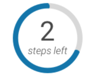
Pero no puedo obtener la esquina redondeada hasta ahora, puedo obtener la barra de progreso circular.
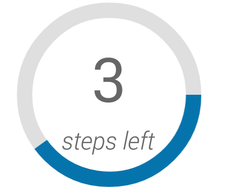
Estoy intentando dibujarlo usando el dibujable xml.
 <ProgressBar
                android:id="@+id/onboarding_activity_progress_bar"
                android:layout_gravity="center"
                android:padding="10dp"
                android:layout_width="120dp"
                android:layout_height="120dp"
                style="?android:attr/progressBarStyleHorizontal"
                android:progressDrawable="@drawable/progressbar_onboarding_view"
                tools:progress="60"/>
Progressbar_onboarding_view.xml
<layer-list xmlns:android="http://schemas.android.com/apk/res/android">
    <item android:id="@android:id/background">
        <shape android:useLevel="false"
               android:innerRadiusRatio="2.0"
               android:shape="ring"
               android:thickness="10dp">
            <solid android:color="@color/progress_bar_background_color" />
            <corners android:radius="50dp"/>
        </shape>
    </item>
    <item android:id="@android:id/progress">
        <shape
              xmlns:android="http://schemas.android.com/apk/res/android"
              android:useLevel="true"
              android:innerRadiusRatio="2.0"
              android:shape="ring"
              android:thickness="10dp">
            <solid android:color="@color/progress_bar_color" />
        </shape>
        <!--
        <scale
              android:drawable="@drawable/progressbar_round_corner"
              android:scaleWidth="98%" /> -->
    </item>
</layer-list>
progressbar_rounded_corner.xml
<?xml version="1.0" encoding="utf-8"?>
<shape xmlns:android="http://schemas.android.com/apk/res/android" >

   <corners
         android:radius="10dp"/>

   <solid android:color="@android:color/white" />

   <stroke
         android:width="1dp"
         android:color="@android:color/holo_red_dark" />

</shape>
Intenté usar el parámetro de escala pero la esquina de progreso no cambió. No estoy seguro de cómo lograr la esquina redondeada. Por favor ayuda, realmente lo apreciaría.
Una clase simple y eficiente que amplía la View para dibujar un progreso circular, con esquinas redondeadas como opción. El color de progreso, el color de fondo, el ancho del trazo también son personalizables.
import android.content.Context
import android.graphics.Canvas
import android.graphics.Paint
import android.graphics.RectF
import android.util.AttributeSet
import android.view.View
import androidx.annotation.FloatRange

class CircularProgressView : View {
  constructor(context: Context) : super(context)
  constructor(context: Context, attrs: AttributeSet?) : super(context, attrs)
  constructor(context: Context, attrs: AttributeSet?, defStyleAttr: Int) : super(context, attrs, defStyleAttr)

  private val progressPaint: Paint = Paint(Paint.ANTI_ALIAS_FLAG).apply {
    style = Paint.Style.STROKE
  }
  private val backgroundPaint: Paint = Paint(Paint.ANTI_ALIAS_FLAG).apply {
    style = Paint.Style.STROKE
  }

  private val rect = RectF()
  private val startAngle = -90f
  private val maxAngle = 360f
  private val maxProgress = 100

  private var diameter = 0f
  private var angle = 0f

  override fun onDraw(canvas: Canvas) {
    drawCircle(maxAngle, canvas, backgroundPaint)
    drawCircle(angle, canvas, progressPaint)
  }

  override fun onSizeChanged(width: Int, height: Int, oldWidth: Int, oldHeight: Int) {
    diameter = Math.min(width, height).toFloat()
    updateRect()
  }

  private fun updateRect() {
    val strokeWidth = backgroundPaint.strokeWidth
    rect.set(strokeWidth, strokeWidth, diameter - strokeWidth, diameter - strokeWidth)
  }

  private fun drawCircle(angle: Float, canvas: Canvas, paint: Paint) {
    canvas.drawArc(rect, startAngle, angle, false, paint)
  }

  private fun calculateAngle(progress: Float) = maxAngle / maxProgress * progress

  fun setProgress(@FloatRange(from = 0.0, to = 100.0) progress: Float) {
    angle = calculateAngle(progress)
    invalidate()
  }

  fun setProgressColor(color: Int) {
    progressPaint.color = color
    invalidate()
  }

  fun setProgressBackgroundColor(color: Int) {
    backgroundPaint.color = color
    invalidate()
  }

  fun setProgressWidth(width: Float) {
    progressPaint.strokeWidth = width
    backgroundPaint.strokeWidth = width
    updateRect()
    invalidate()
  }

  fun setRounded(rounded: Boolean) {
    progressPaint.strokeCap = if (rounded) Paint.Cap.ROUND else Paint.Cap.BUTT
    invalidate()
  }
}