truncar - CSS desbordamiento de texto en una celda de tabla?
truncar texto css (10)
En caso de que no quieras establecer ancho fijo a nada.
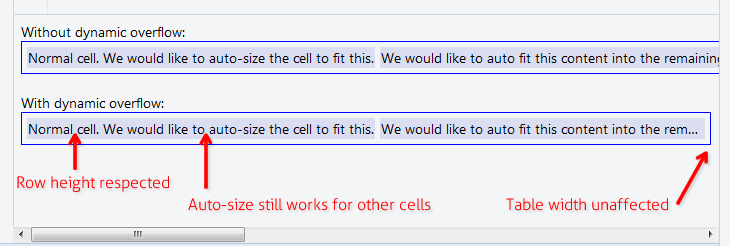
La solución a continuación le permite tener un contenido de celda de tabla que es largo, pero no debe afectar el ancho de la tabla principal, ni la altura de la fila principal. Por ejemplo, donde desea tener una tabla con width:100% que aún aplica la característica de tamaño automático a todas las demás celdas. Útil en las cuadrículas de datos con la columna "Notas" o "Comentario" o algo así.
Agrega estas 3 reglas a tu CSS:
.text-overflow-dynamic-container {
    position: relative;
    max-width: 100%;
    padding: 0 !important;
    display: -webkit-flex;
    display: -moz-flex;
    display: flex;
    vertical-align: text-bottom !important;
}
.text-overflow-dynamic-ellipsis {
    position: absolute;
    white-space: nowrap;
    overflow-y: visible;
    overflow-x: hidden;
    text-overflow: ellipsis;
    -ms-text-overflow: ellipsis;
    -o-text-overflow: ellipsis;
    max-width: 100%;
    min-width: 0;
    width:100%;
    top: 0;
    left: 0;
}
.text-overflow-dynamic-container:after,
.text-overflow-dynamic-ellipsis:after {
    content: ''-'';
    display: inline;
    visibility: hidden;
    width: 0;
}
Formato HTML como este en cualquier celda de la tabla en la que desee un desbordamiento de texto dinámico:
<td>
  <span class="text-overflow-dynamic-container">
    <span class="text-overflow-dynamic-ellipsis" title="...your text again for usability...">
      //...your long text here...
    </span>
  </span>
</td>
Además, aplique el min-width deseado (o ninguno) a la celda de la tabla.
Por supuesto, el violín: https://jsfiddle.net/9wycg99v/23/
Quiero usar el text-overflow CSS en una celda de la tabla, de modo que si el texto es demasiado largo para caber en una línea, se recortará con puntos suspensivos en lugar de ajustarse a varias líneas. es posible?
Intenté esto:
td {
  overflow: hidden;
  text-overflow: ellipsis;
  white-space: nowrap;
}
Pero el white-space: nowrap parece hacer que el texto (y su celda) se expanda continuamente hacia la derecha, empujando el ancho total de la tabla más allá del ancho de su contenedor. Sin embargo, sin él, el texto continúa envolviéndose en varias líneas cuando llega al borde de la celda.
Si solo quieres que la mesa se desplace automáticamente
Sin utilizar max-width columna porcentual o table-layout: fixed etc.
https://jsfiddle.net/tturadqq/
Cómo funciona:
Paso 1: Simplemente deja que la mesa se adapte automáticamente.
Cuando hay una o más columnas con mucho texto, las otras columnas se reducirán tanto como sea posible, luego se ajustará el texto de las columnas largas:
Paso 2: Envuelva el contenido de la celda en un div, luego configure ese div en max-height: 1.1em
(El 0.1em adicional es para los caracteres que se representan un poco por debajo de la base del texto, como la cola de ''g'' y ''y'')
Paso 3: Establecer el title en los divs
Esto es bueno para la accesibilidad y es necesario para el pequeño truco que usaremos en un momento.
Paso 4: Agrega un CSS ::after en el div
Este es el truco. Establecemos un CSS ::after , con el content: attr(title) , luego lo colocamos en la parte superior de la div y configuramos text-overflow: ellipsis . Lo he teñido de rojo aquí para que quede claro.
(Observe que la columna larga ahora tiene puntos suspensivos de relaves)
Paso 5: establece el color del texto div en transparent
¡Y hemos terminado!
Cuando está en el porcentaje de ancho de la tabla, o no puede establecer un ancho fijo en la celda de la tabla. Puede aplicar table-layout: fixed; para que funcione.
table {
  table-layout: fixed;
  width: 100%;
}
td {
  text-overflow: ellipsis;
  white-space: nowrap;
  overflow: hidden;
  border: 1px solid red;
}
<table>
  <tr>
    <td>Lorem ipsum and dim sum yeah yeah yeah. Lorem ipsum and dim sum yeah yeah yeah. Lorem ipsum and dim sum yeah yeah yeah. Lorem ipsum and dim sum yeah yeah yeah. Lorem ipsum and dim sum yeah yeah yeah.</td>
    <td>Lorem ipsum and dim sum yeah yeah yeah. Lorem ipsum and dim sum yeah yeah yeah. Lorem ipsum and dim sum yeah yeah yeah. Lorem ipsum and dim sum yeah yeah yeah. Lorem ipsum and dim sum yeah yeah yeah.</td>
  </tr>
</table>
Envolver el contenido celular en un bloque flexible. Como beneficio adicional, la celda se ajusta automáticamente al ancho visible.
table {
  width: 100%;
}

div.parent {
  display: flex;
}

div.child {
  flex: 1;
  width: 1px;
  overflow-x: hidden;
  text-overflow: ellipsis;
}
<table>
  <tr>
    <td>
      <div class="parent">
        <div class="child">
          xxxxxxxxxxxxxxxxxxxxxxxxxxxxxxxxxxxxxxxxxxxxxxxxxxxxxxxxxxxxxxxxxxxxxxxxxxxxxxxxxxxxxxxxxxxxxxxxxxxxxxxxxxxxxxxxxxxxxxxxxxxxxxxxxxxxxxxxxxxxxxxxxxxxxxxxxxxxxxxxxxxxxxxxxxxxxxxxxxxxxxxxxxxxxxxxxxxxxxxxxxxxxxxxxxxxxxxxxxxxxxxxxxxxxxxxxxxxxxxxxxxxxxxxxxxxxxxxxxxxxxxxxxxxxxxxxxxxxxxxxxxxxxxxxxxxxxxxxxxxxxxxxxxxxxxxxxxxxxxxxxxxxxxxxxxxxxxxxxxxxxxxxxxxxxxxxxxxxxxxxxxxxxxxxxxxxxxxxxxxxxxxxxxxxxxxxxxxxxxxxxxxxxxxxxxxxxxxxxxxxxxxxxxxxxxxxxxxxxxxxxxxxxxxxxxxxxxxxxxxxxxxxxxxxxxxxxxxxxxxxxxxxxxxxxxxxxxxxxxxxxxxxxxxxxxxxxxxxxxxxxxxxxxxxxxxxxxxxxxxxxxxxxxxxxxxxxxxxxxxxxxxxxxxxxxxxxxxxxxxxxxxxxxxxxxxxxxx
        </div>
      <div>
    </td>
  </tr>
</table>
Esta es la versión que funciona en IE 9.
<div style="display:table; table-layout: fixed; width:100%; " >
        <div style="display:table-row;">
            <div style="display:table-cell;">
                <table style="width: 100%; table-layout: fixed;">
                    <div style="text-overflow:ellipsis;overflow:hidden;white-space:nowrap;">First row. Lorem Ipsum is simply dummy text of the printing and typesetting industry. Lorem Ipsum has been the industry''s standard dummy text ever since the 1500s, when an unknown printer took a galley of type and scrambled it to make a type specimen book. It has survived not only five centuries, but also the leap into electronic typesetting, remaining essentially unchanged. It was popularised in the 1960s with the release of Letraset sheets containing Lorem Ipsum passages, and more recently with desktop publishing software like Aldus PageMaker including versions of Lorem Ipsum.</div>
                </table>
            </div>
            <div style="display:table-cell;">
                Top right Cell.
            </div>
        </div>
        <div style="display:table-row;">
            <div style="display:table-cell;">
                <table style="width: 100%; table-layout: fixed;">
                    <div style="text-overflow:ellipsis;overflow:hidden;white-space:nowrap;">Second row - Lorem Ipsum is simply dummy text of the printing and typesetting industry. Lorem Ipsum has been the industry''s standard dummy text ever since the 1500s, when an unknown printer took a galley of type and scrambled it to make a type specimen book. It has survived not only five centuries, but also the leap into electronic typesetting, remaining essentially unchanged. It was popularised in the 1960s with the release of Letraset sheets containing Lorem Ipsum passages, and more recently with desktop publishing software like Aldus PageMaker including versions of Lorem Ipsum.</div>
                </table>
            </div>
            <div style="display:table-cell;">
                Bottom right cell.
            </div>
        </div>
    </div>
La especificación de un max-width o max-width fijo no funciona en todas las situaciones, y la tabla debe ser fluida y espaciar automáticamente sus celdas. Para eso son las mesas.
Utilice esto: http://jsfiddle.net/maruxa1j/
<td class="ellipsis"><span>This Text Overflows and is too large for its cell.</span></td>
.ellipsis {
position: relative;
}
.ellipsis:before {
content: '' '';
visibility: hidden;
}
.ellipsis span {
position: absolute;
left: 0;
right: 0;
white-space: nowrap;
overflow: hidden;
text-overflow: ellipsis;
}
Funciona en IE9 y otros navegadores.
Para recortar texto con puntos suspensivos cuando se desborda una celda de la tabla, deberá establecer la propiedad CSS de max-width en cada clase de td para que el desbordamiento funcione. No se requieren div divisiones adicionales
td {
    max-width: 100px;
    overflow: hidden;
    text-overflow: ellipsis;
    white-space: nowrap;
}
Para diseños sensibles; use la propiedad CSS de max-width para especificar el ancho mínimo efectivo de la columna, o simplemente use max-width: 0; para una flexibilidad ilimitada. Además, la tabla que contiene necesitará un ancho específico, generalmente width: 100%; , y las columnas normalmente tendrán su ancho establecido como porcentaje del ancho total
table {
    width: 100%;
}
td {
    max-width: 0;
    overflow: hidden;
    text-overflow: ellipsis;
    white-space: nowrap;
}
td.columnA {
    width: 30%;
}
td.columnB {
    width: 70%;
}
Histórico: para IE 9 (o menos) necesita tener esto en su HTML, para solucionar un problema de representación específico de IE
<!--[if IE]>
<style>
    table {
        table-layout: fixed;
        width: 100px;
    }
</style>
<![endif]-->
Parece que si especifica table-layout: fixed; en el elemento table , entonces sus estilos para td deberían tener efecto. Sin embargo, esto también afectará el tamaño de las células.
Sitepoint discute un poco los métodos de diseño de tablas aquí: http://reference.sitepoint.com/css/tableformatting
Resolví esto usando un div absolutamente posicionado dentro de la celda (relativo).
td {
    position: relative;
}
td > div {
    position: absolute;
    white-space: nowrap;
    overflow: hidden;
    text-overflow: ellipsis;
    max-width: 100%;
}
Eso es. Luego puede agregar un valor top: al div o centrarlo verticalmente:
td > div {
    top: 0;
    bottom: 0;
    margin: auto 0;
    height: 1.5em; // = line height
}
Para obtener algo de espacio en el lado derecho, puede reducir un poco el ancho máximo.
¿ Por qué sucede esto?
Parece que esta sección en w3.org sugiere que el desbordamiento de texto se aplica solo a los elementos de bloque :
11.1.  Overflow Ellipsis: the ‘text-overflow’ property

text-overflow      clip | ellipsis | <string>
Initial:           clip
APPLIES TO:        BLOCK CONTAINERS               <<<<
Inherited:         no
Percentages:       N/A
Media:             visual
Computed value:    as specified
El MDN dice lo mismo .
Este jsfiddle tiene su código (con algunas modificaciones de depuración), que funciona bien si se aplica a un div lugar de un td . También tiene la única solución que pude pensar rápidamente, envolviendo el contenido de la td en un bloque div contiene. Sin embargo, eso me parece un marcado "feo", así que espero que alguien más tenga una mejor solución. El código para probar esto se ve así:
td, div {
  overflow: hidden;
  text-overflow: ellipsis;
  white-space: nowrap;
  border: 1px solid red;
  width: 80px;
}
Works, but no tables anymore:
<div>Lorem ipsum and dim sum yeah yeah yeah. Lorem ipsum and dim sum yeah yeah yeah. Lorem ipsum and dim sum yeah yeah yeah. Lorem ipsum and dim sum yeah yeah yeah. Lorem ipsum and dim sum yeah yeah yeah.</div>

Works, but non-semantic markup required:
<table><tr><td><div>Lorem ipsum and dim sum yeah yeah yeah. Lorem ipsum and dim sum yeah yeah yeah. Lorem ipsum and dim sum yeah yeah yeah. Lorem ipsum and dim sum yeah yeah yeah. Lorem ipsum and dim sum yeah yeah yeah.</div></td></tr></table>